Antifašizem
Danes
Identity ✓
Antifašizem Danes can be translated in English as ‘Anti-Fascism Today’. Often the term is extended only to the fight against all the far-right regimes or reactionary-ones, but de facto anti-fascism was — and still is — an integral part of the ideological structure of many democracies. It is the medulla of democracy par excellence. We should not look at anti-fascism as a ‘thing of the past’, outdated: we must — on the contrary — respect its tenets and values. Today more than ever.
The youth committee of SKGZ (The Slovenian Cultural and Economic Union in Italy) commissioned me the creation of a visual identity to represent precisely this concept of relevance and actuality of anti-fascism. A ‘sign’ to be used as a mark for various conventions and events, organized with the intention of stimulating attention on issues such as co-existence and mutual respect.
So anti-fascism seen in a today’s perspective, anti-fascism that transmits its values on current themes such as combating xenophobia, equal rights for all, issues of migration of peoples and refugees, culture, war, peace, bullying, LGBT, women’s rights, globalization, environment, violence, exploitation at work, problems of the homeless and other very delicate problematics — too often discussed with easy ‘populism’ and watched by the many with blinders. Stimulate a dialogue that does not divide but unites, open and peaceful.
Concept
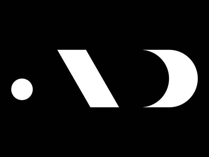
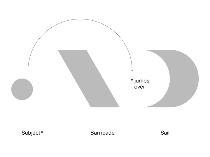
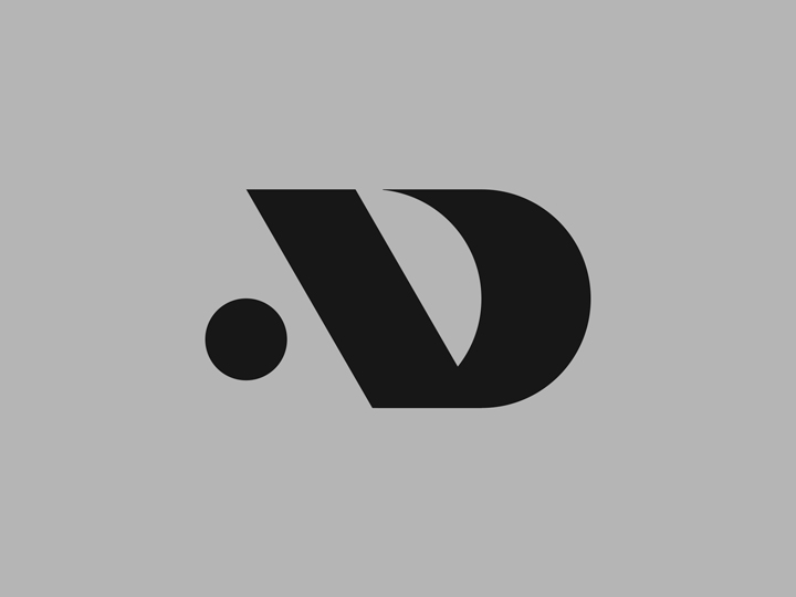
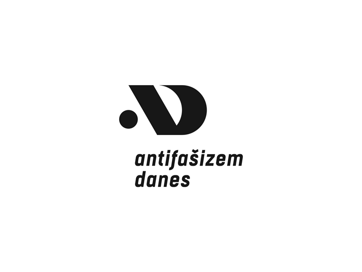
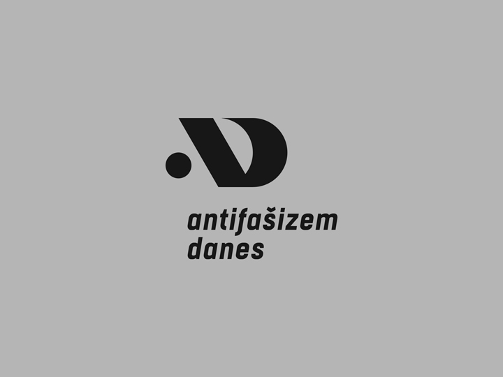
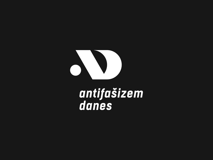
The concept of the visual identity rotates around two main concepts: a concept ‘of lettering’ and a more ‘symbolic one’. The initials of the two words ‘Anti’ and ‘Fascism’ constitute the ‘structural basis‘ of the logo. The letters ‘A’ and ‘D’ — vectorially melted together — are modeled graphically in such a way as to give the feeling of a forward movement, purposeful and propositive.
Into the visual amalgam there can be seen three ‘symbolic’ elements that actually make up the mark. There is a circle (a dot) that represents the subject, the open-minded thinking human being. There is a bold ‘slash’ graphism that epitomizes a barricade, the thinking barriers, the obstacle, fascism. And there is also a semicircle that symbolizes the sail, a journey into a better future, a path to coexistence. The subject — in the pure conceptual viewing of the logo — jumps over the barricade and then sails into a better society, built on anti-fascism. ‘Anti-Fascism Today’: necessary for a better tomorrow.


Structure
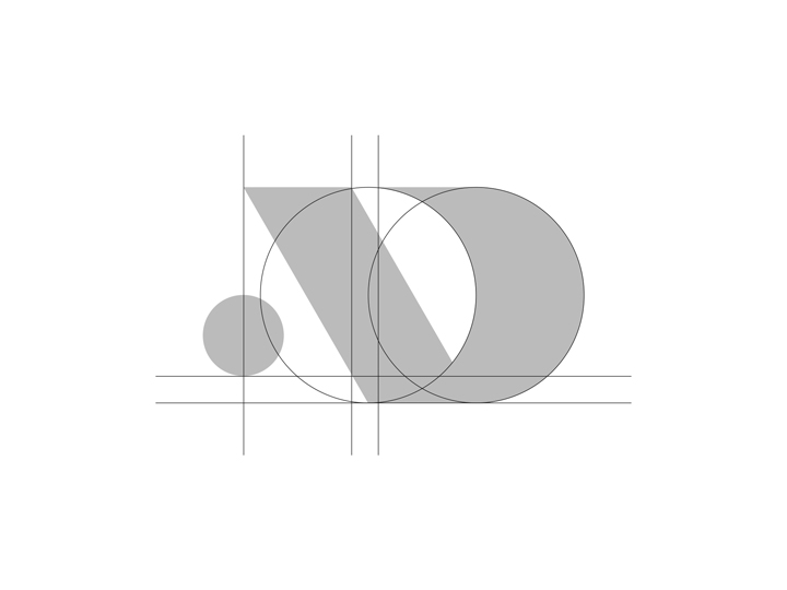
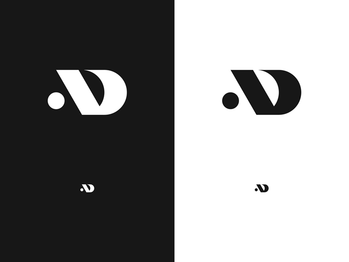
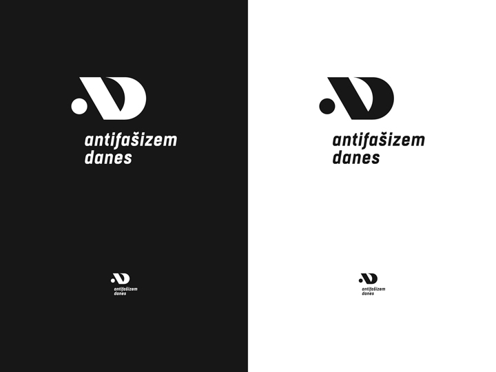
The structure of the mark is based on a rigid grid system, made of circles, lines and spacings — proportionate between themselves. The ‘slash’ has an angle of 45°. The graphic-amalgam reminds of the (capital) letters ‘A’ and ‘D’ but is at the same time also a pretty elegant and recognizable sign.


Typography
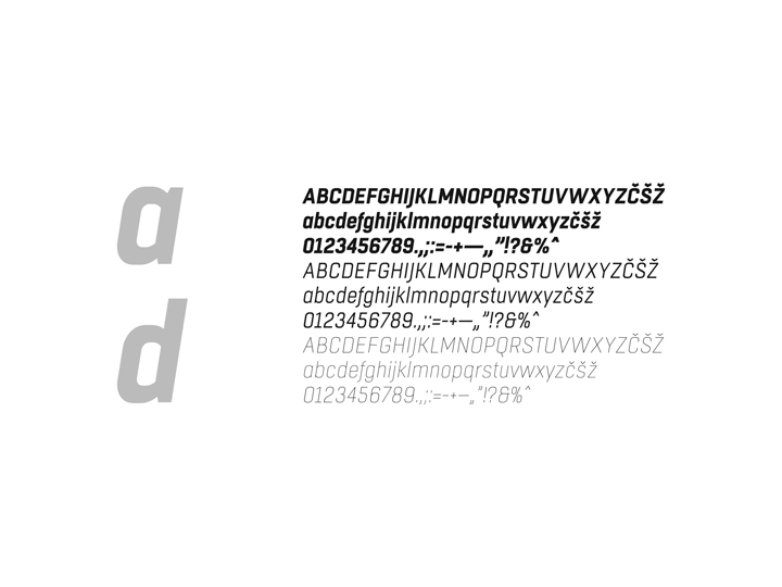
The typography selected for the lettering-composition of the Antifašizem Danes naming to be accosted to the mark is a pretty modern font family, smartly compressed but with a good readability. Three weights of the characters were selected then to be used as the main typography for all the applications of the visual identity (such as posters, flyers, press stuff).

Colors
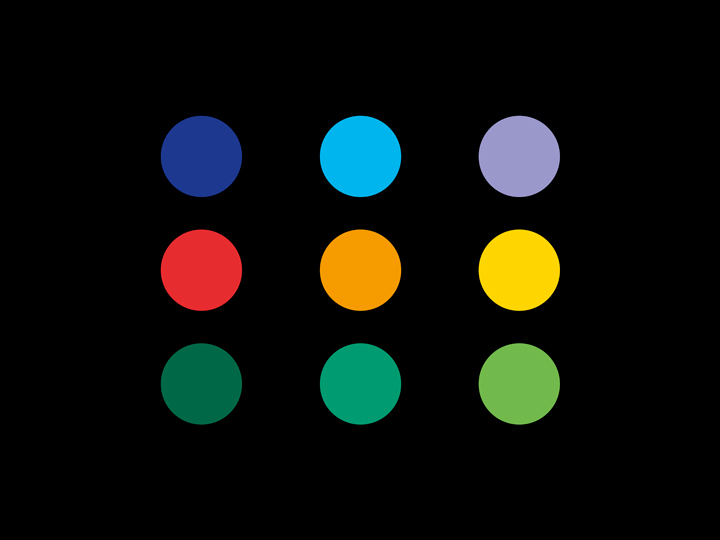
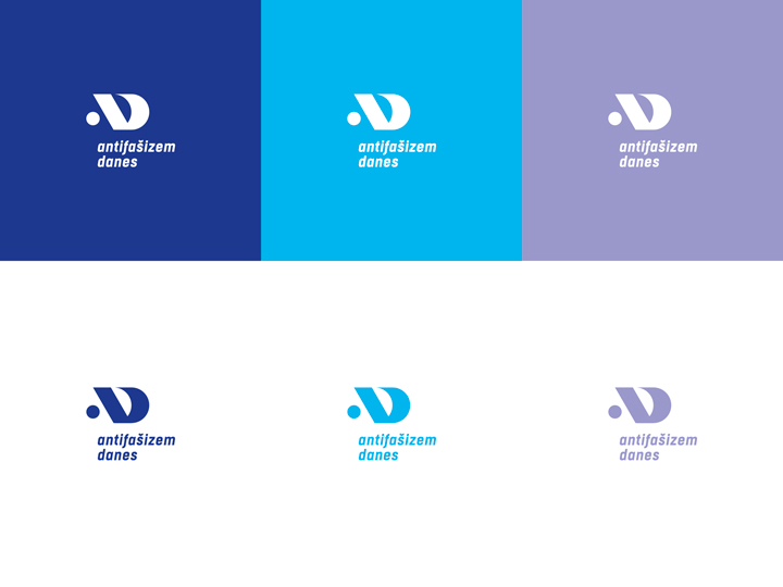
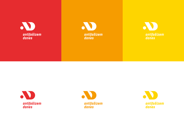
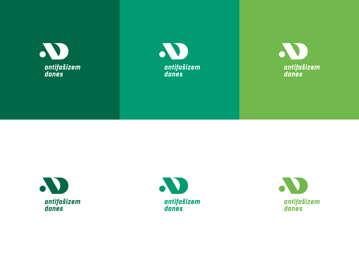
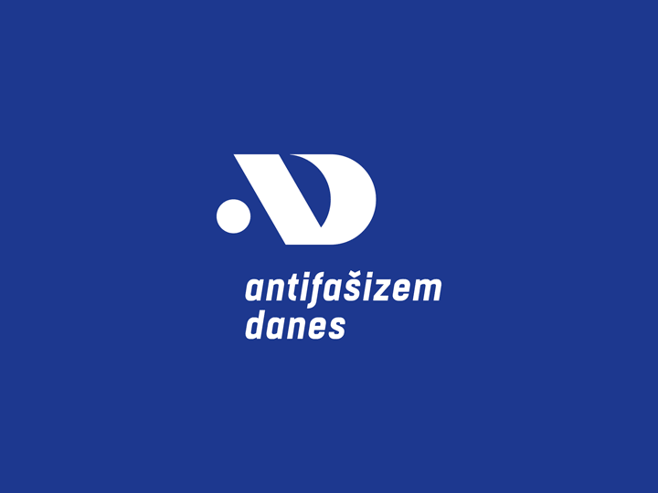
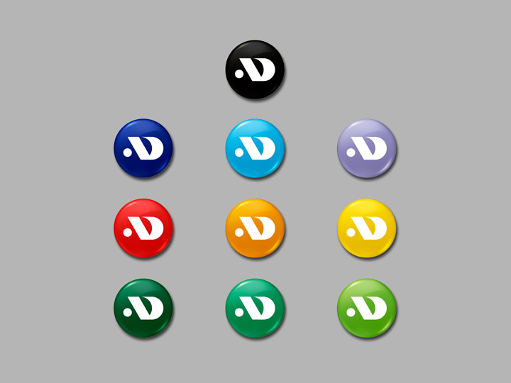
The color palette selected for the logotype recalls vivid, rainbow and fresh colors. These colors were chosen to avoid the common ‘only red classical anti-fascism’ characterisation and to take a step beyond the typical iconography of anti-fascism, too often linked strictly (just) to political purposes. This multi-color palette is, in this way, also very useful for the ‘merch’ applications of the visual identity.
Application
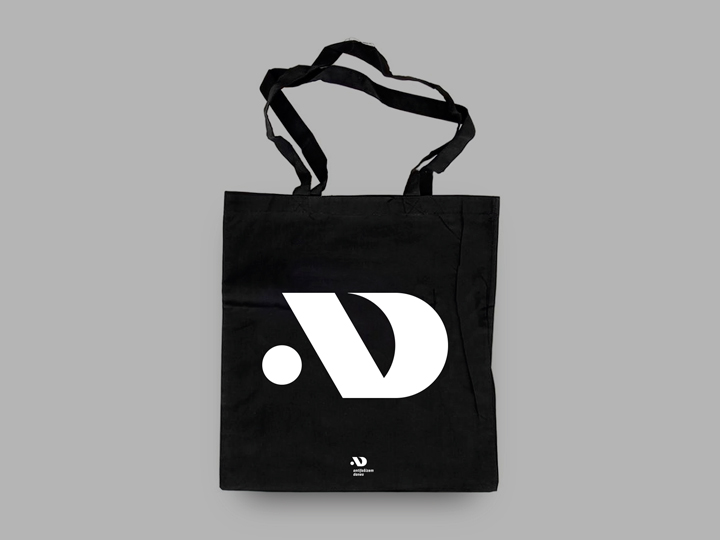
The Antifašizem Danes logo applied on a (silkscreened) tote bag.
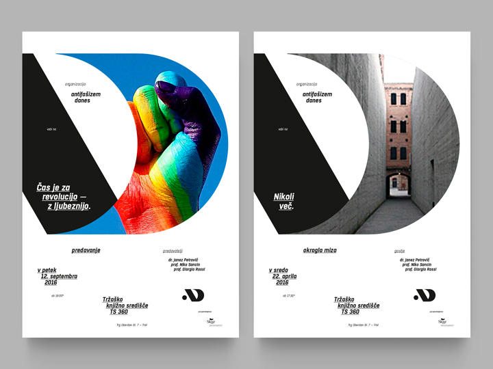
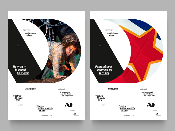
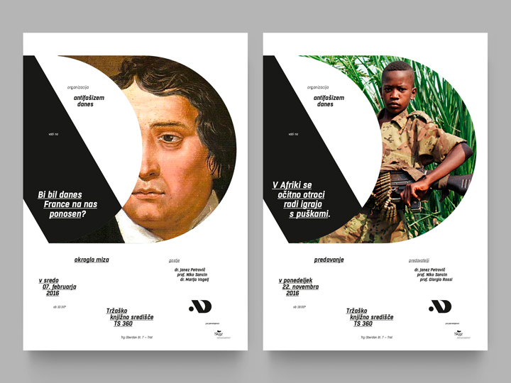
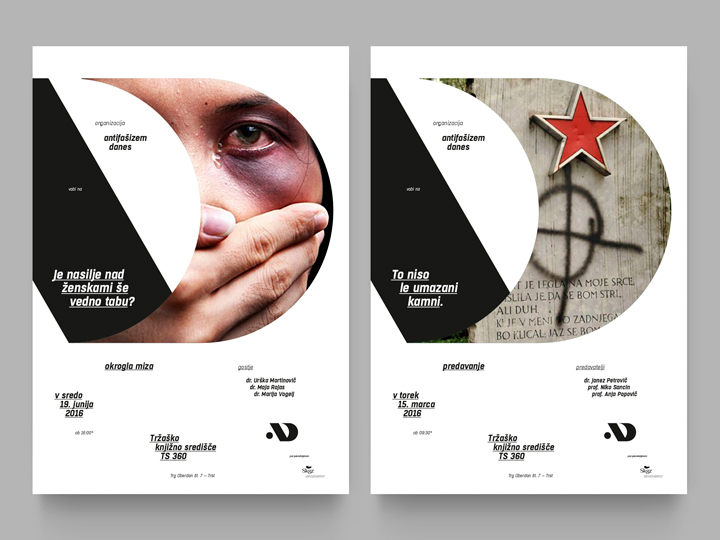
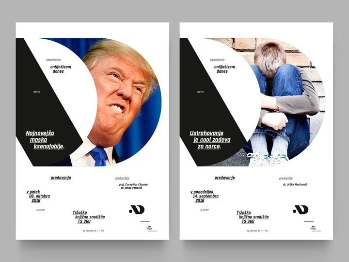
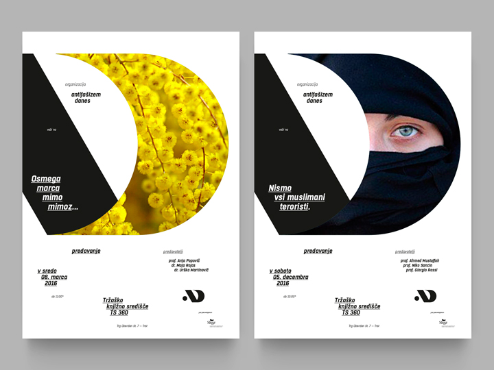
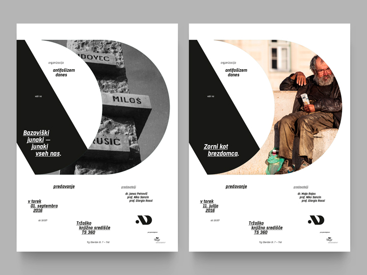
Posters
Set of posters for a few conventions and talks (supposed) to be organized by the staff of Antifašizem Danes. The mark is here decontextualized and used as a container and — at the same time — as a graphic ornament for the images and texts of each specific event. The result is a coordinated bunch of paper sheets, elegant but fresh.
Notes
The photographic images shared in this visual identity presentation (in the ‘posters section’) are used with no commercial intention. No kind of profit was ever derived from it. All the photographies and all the portraits used for the posters are managed here with the sole purpose of emphasizing the presentation of the logotype’s usage. These have never actually been really printed or distributed.
Credits
Creative direction → Aleš Brce
Art direction → Aleš Brce
Graphic design → Aleš Brce
Year → 2016