Full Wave —
Branding
Identity ✓
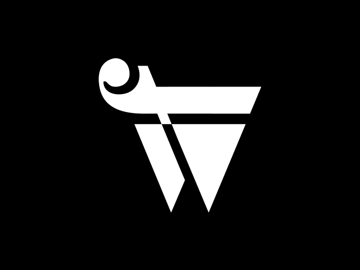
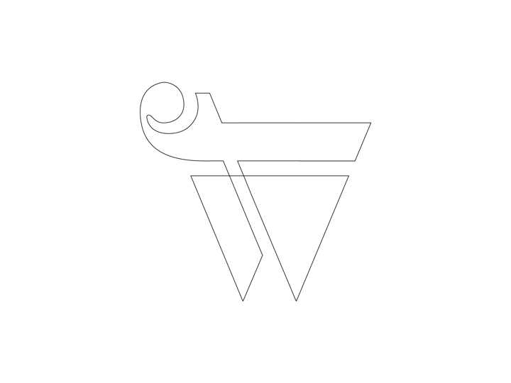
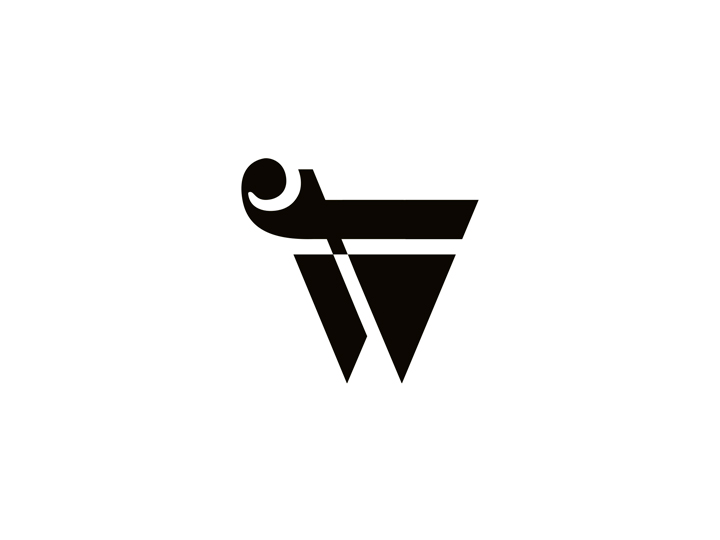
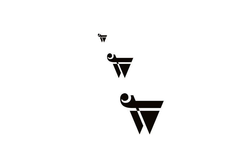
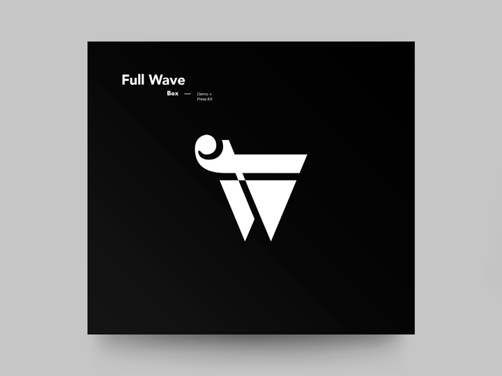
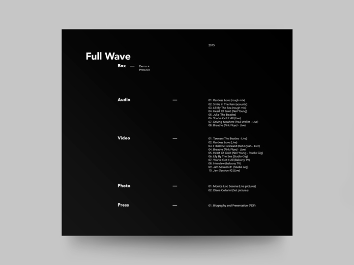
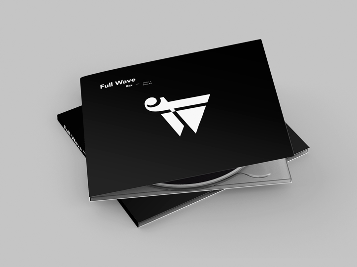
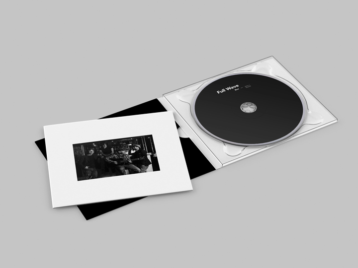
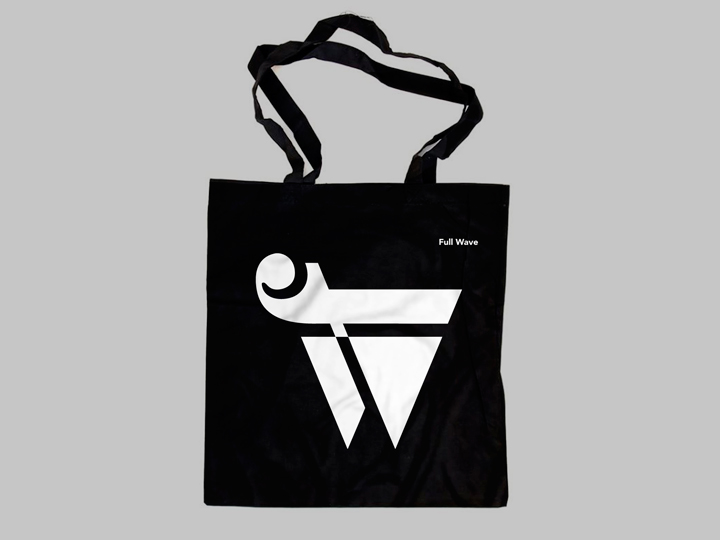
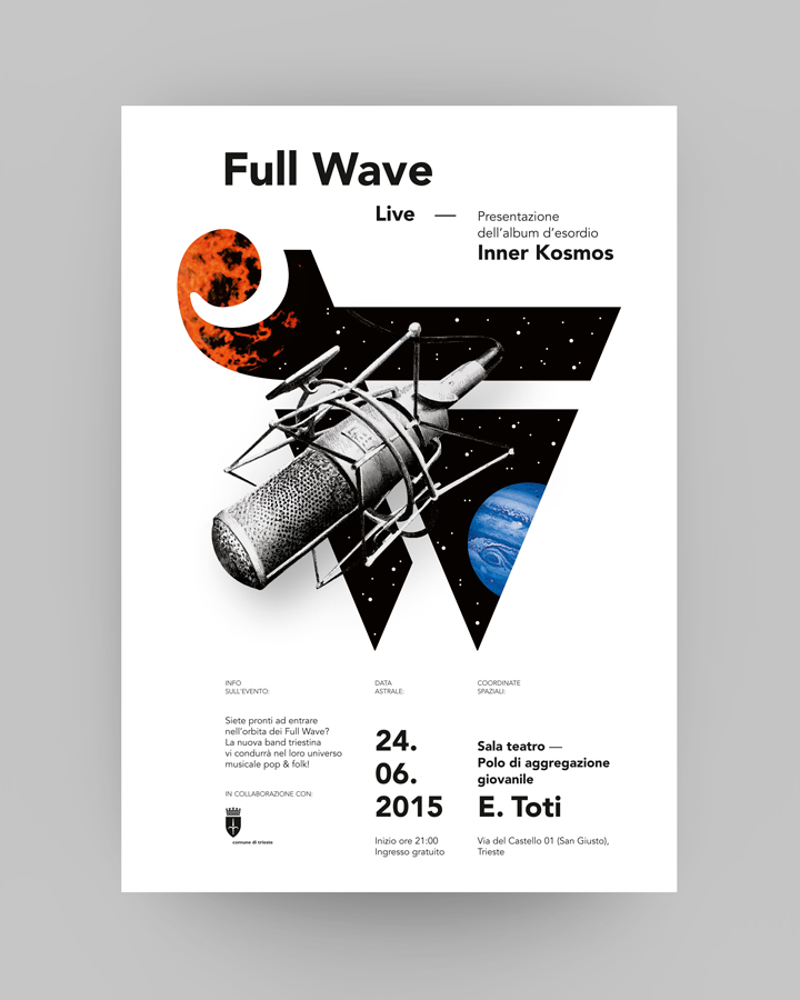
Full Wave is a brit pop indie band from Trieste (Italy). I made the visual identity, trying to transmit the elegance and the semplicity of the group, adding a slight ‘rocking’ feeling to the ‘brand’. It consist, basically, of a ‘nesting’ of two letters — the F of ‘Full’ and the W of ‘Wave’. Those two letters are differnt in their styles (the F is a ‘curvy’ one and the W is a ‘geometric’ one), but their contrast reflects the two aspects of the band: the emotional and sweet attitude of the group in their ballad-songs and the energy of the group’s rock-songs. Detail: the upper serif of the F letter reminds of a wave.

Credits
Creative direction → Aleš Brce
Art direction → Aleš Brce
Graphic design → Aleš Brce
Year → 2015