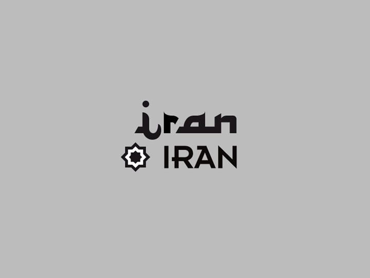
Iran Iran
— Live at Tetris
Poster ✓
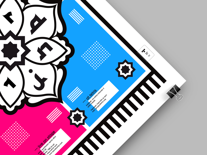
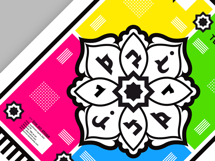
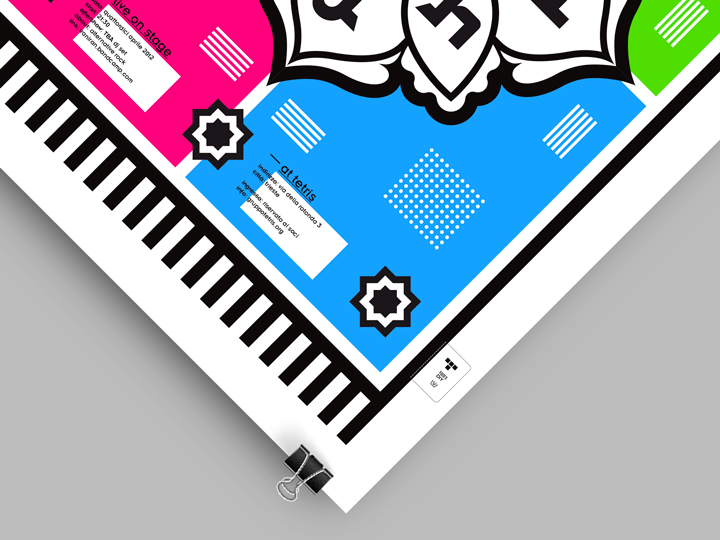
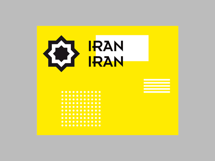
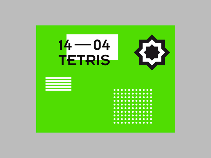
Poster made for the Iran Iran — a post-punk/indie band — concert at Tetris club. It basically consists in a sparkling fluo ‘carpet’ illustration that plays with the event’s live-performing band’s name, Iran Iran: it can be seen as a sort of mixture between persian ornaments + mandala lettering (refers to “Iran”) and eighties colors/dots and stripes + font in use (refers to the famous band “Duran Duran”). The main concept of the work can be described as a strange melting pot of persian culture and Duran Duran eighties iconography.
The concept and the graphic elements used in the working/creative process are explained as a ‘small presentation in chapters’ by scrolling down the page.
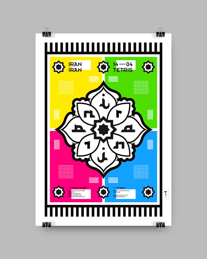
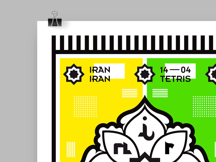
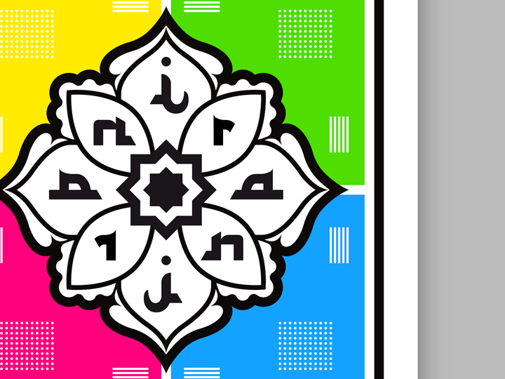
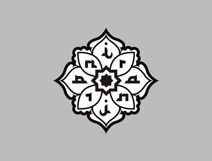
Persian glyphs meet
Neville Brody typography
The lettering on the poster uses two different kind of ‘fonts’. The first one — the one used in the illustration for the word “Iran” — is a custom set of glyphs, shapes designed in a way to reconnect the viewer with the old Persian art of writing. The second one — used for the current text, the date and for the informations — is a font named Insignia, designed by great type designer Neville Brody in the late 80’s. This is a pretty symbolic font of the eighties ‘digitalized mood’ decade, even if still designed in a ‘crafty way’. These two different styles of letter forms live together in the poster, in the pure spirit of the design concept that, as said earlier, tries to represent a visual mixture between geometric, persian style and the eighties, flamboyant elements.
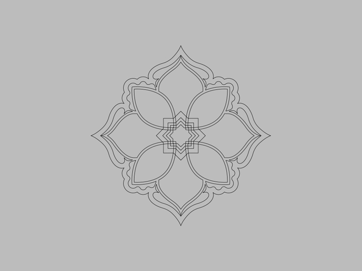
Mandala illustration
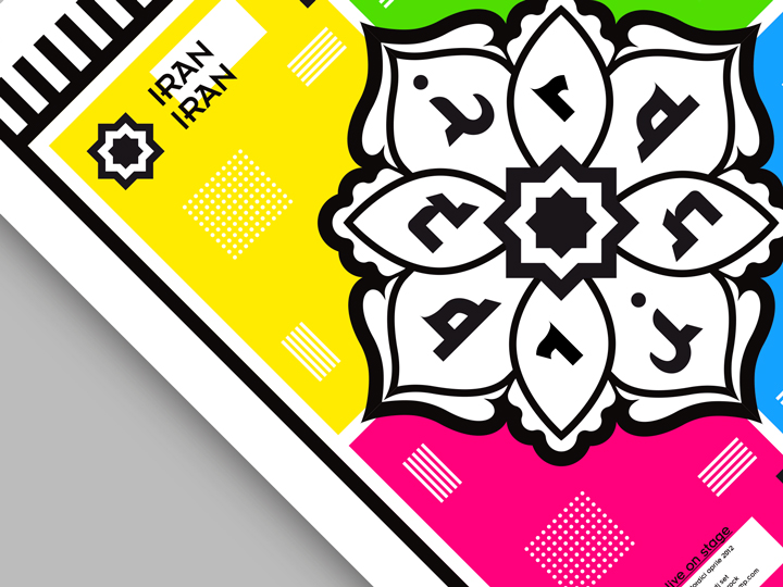
The ‘mandala’ geometric illustration is a bold graphic element of the poster. It is often used as main decoration on persian carpets, so I decided to use it as a sort of centerpiece in the designing area. The mandala contains the persian lettering of the word “Iran” within.
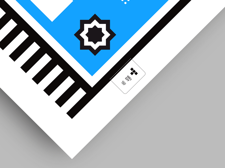
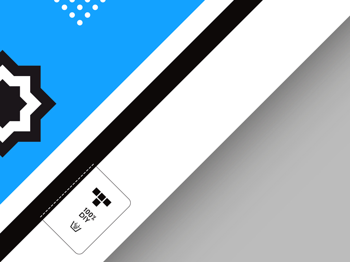
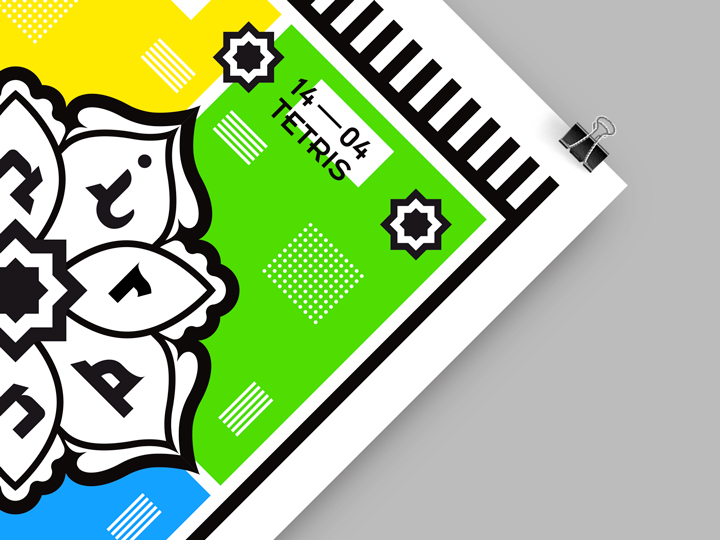
Eighties carpet
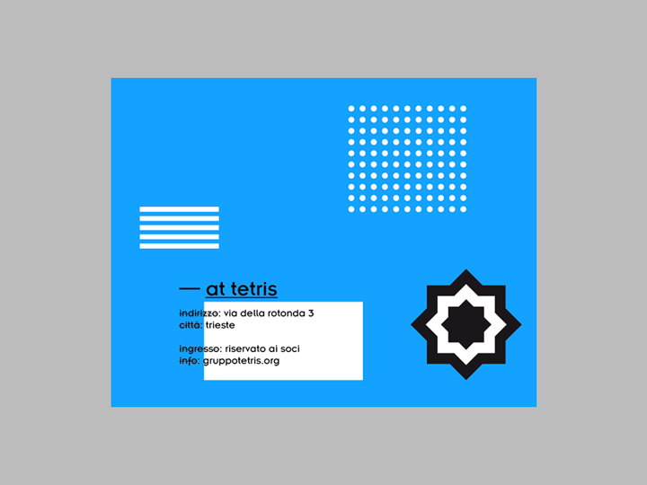
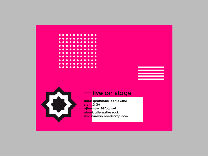
The ‘mandala’ illustration is placed onto an ‘eighties lookalike’ carpet, designed in a very stylized way with some simply black stripes representing its bristles and other elementary geometric shapes (white dots and white stripes + black and white star) representing the rug’s texture.
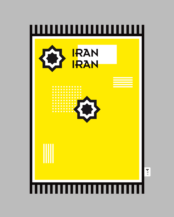
Colors
The use of four fluo colors recalls the atmosphere of the eighties. Also the use of graphic elements like ‘bunch of dots’ and ‘set of stripes’ — used here in white, paper color — reconnects to the 80’s era.
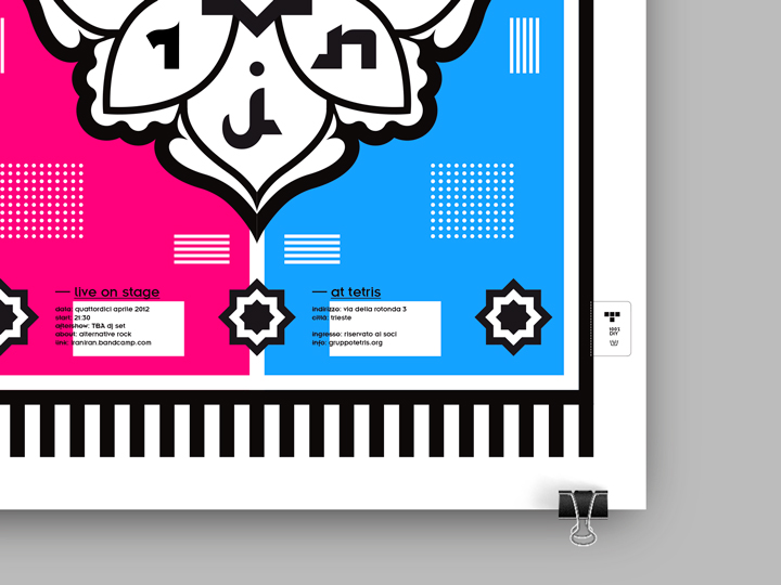
Logo on the label
A detail: the Tetris club logo is present in the poster. Such a small reminder, available on the carpet’s tag.