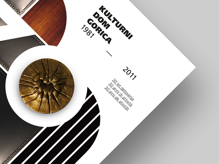
Kulturni Dom Gorica
— 30th anniversary
Art direction ✓
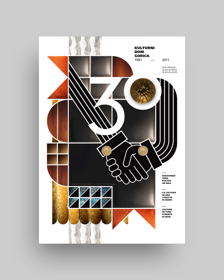
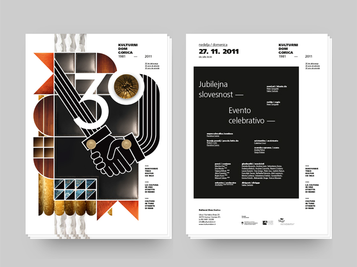
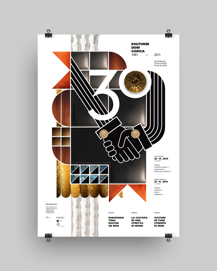
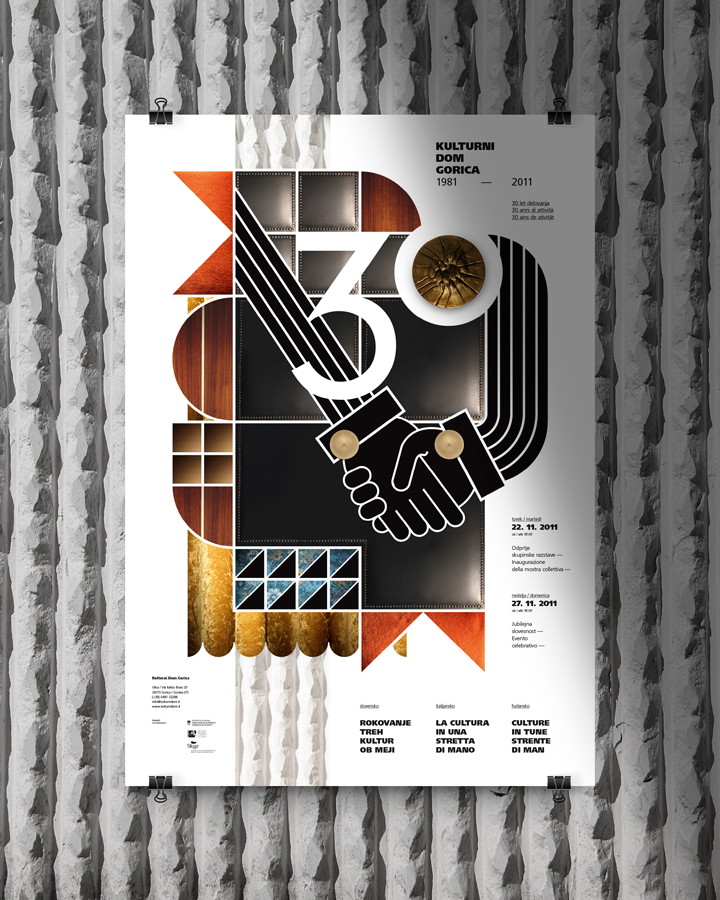
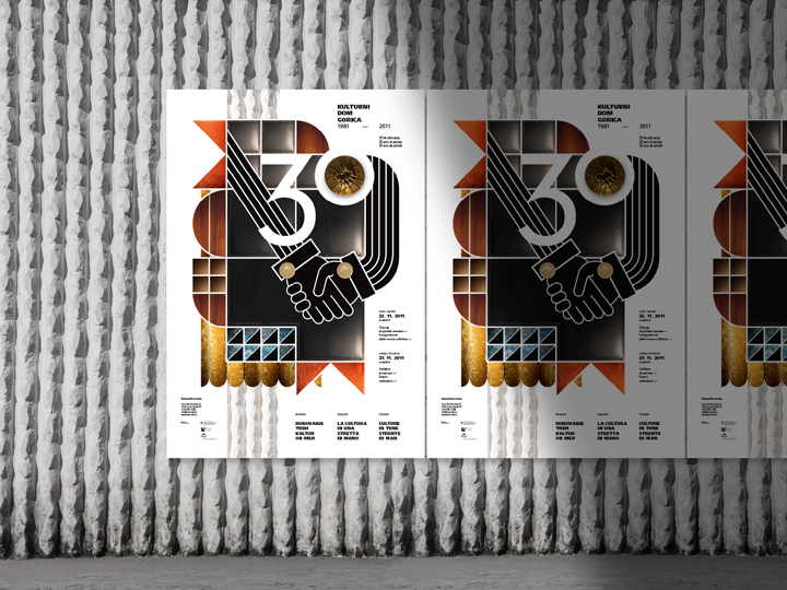
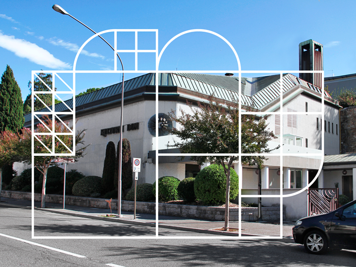
I was asked to design a celebrative identity for the Kulturni Dom theater in Gorica in occasion of the 30th anniversary of cultural activity in the Italy/Slovenia cross-border territory. The concept of the whole initiative was focused on the idea of ‘shaking hands’ as a metaphor of cultural melting and cross-border collaborations in the artistic/cultural fields. In this mood I decided to represent the anniversary event in a strictly immediate visual item ― designing a huge and stylized handshake ― set in an illustrated background ― that perfectly mirrors the floor plan of the theatre ― enriched and decorated with textures of materials ― all things that are part of the historic interior design of the structure.
The concept explained
through nine textures
and elements
If you are interested in knowing more about the working process of this project the following lines will explain you the methodology ― for how singular or eccentric it could be ― with which I approached in the creation phase. It could sound kinda boring especially in a fast-communicative society as this our is, but fuck this ‘be quick or be dead’ shit, sometimes!
Essentially I started with the main idea of using only textured items present in the theater. Typical theater items such as scene curtains or seats or the hall entrance door. I found that intention pretty funny because the theater at issue looks very vintage and a little bit retro-furnished. Being the place not a hyper chic architectural as consequence the whole design reflects (deliberately) feelings of old memories and jubilee-alike mood. So, why made an ultra cool design for an ultra historical institution when you can dig on oldies!
The animation here below shows you the featured elements, explained one by one by scrolling down.

01
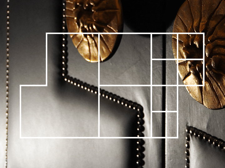
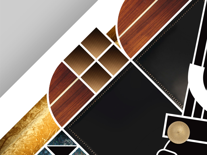
The theather’s planimetry
melts in a huge handshake
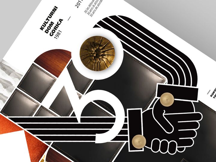
The planimetry of the theater meets in a visual game two shaking hands, creating an illustrated entity/identity. In between the two arms there lays a huge ’30’ number (it is the 30th anniversary of the theater), seeming like to be lulled by this cultural melting pot represented by the big handshake.
02
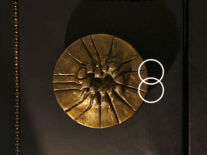
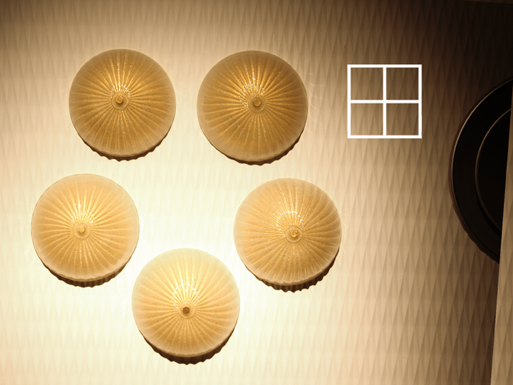
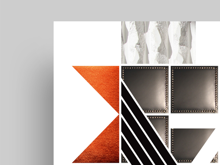
The big door handle
as iconic symbol
The Kulturni Dom Gorica has this pretty massive door handles. As you open the big hall door and enter the room it is impossible to not notice these imposing rounded bronze pulls. I used them as an icon, as a eye-catcher center in the printed matter, a symbol placed over the ’30’ number.
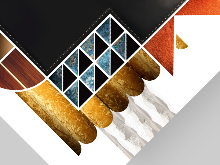
03
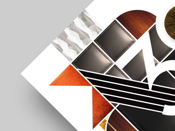
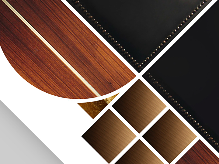
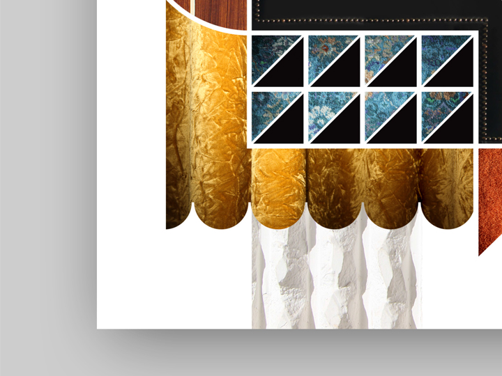
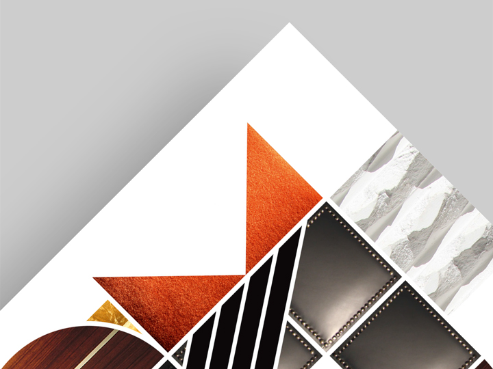
Padded leather door texture
to transmit solemnity
The hall entrance door is leather padded. I used this leather coathing in the illustration as well. Black leather is, in my opinion, very solemn as element of decor. Solemn as the anniversary event I am graphically portraying.
04
The lamps + ceiling texture
as discreet ornaments
The foyer celling and the indoor lamps are used as ‘soft’, almost imperceptible, decorations in the illustrated identity. For example, two small rounded lamps are used as cufflinks of the stylized arm’s jacket sleeves.
05
Wooden wall tiles texture
for elegance
A very refined wood coating is present in the theater. A touch of rusticity that gives to the whole place a feeling of heat and comfort. It perfectly fits to the design we’re talking about as well.
06
Curtain texture
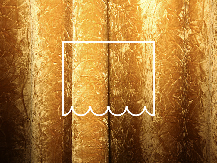
for golden moments
The stage curtains of the theater are very particular: they are golden (made in a kind of fabric that looks like to be gold, more precisely). It seems like the curtains are hiding magic cultural moments to be enjoyed and ― once they open ― there are some ‘golden moments’ that spread among the spectators. Also the curtain element is present in my design, laterally, as a shiny background of the illustration.
07
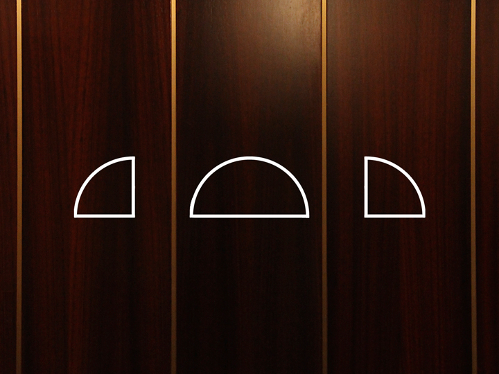
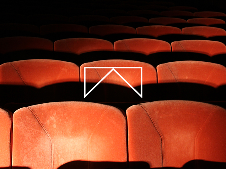
Seat covers
become markers
The cute retro kind of seat covers orange fabric textuizes in the illustrated identity of the event a sort of enormous marker, a signaling element that would highlight the importance of the anniversary.
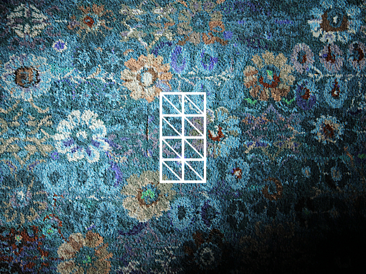
08
The floor moquette
to show some eccentricity
As already said before, in the theater there are some furnishings that are not ‘very modern’ and contemporary. I see them as a sort of ‘sign of the time’, not ugly or out of time. They are just eccentric. A perfect ‘historical’ find is the floreal moquette that covers the floor in the hall. A perfect texture for the anniversary identity.
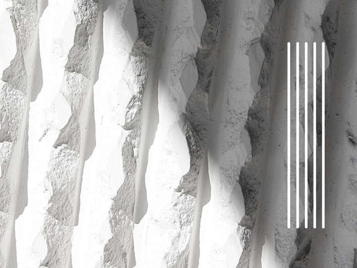
09
The external masonry
as pillar of the illustration
Also the external walls of the theater are very particular. A rustic white masonry wraps the whole building. It is used in the illustrated identity as a background bold strip that could be seen as a pillar that in fact supports the illustration. The last level of textures used in this crazy, out-of-schemes composition. Hope you’ve enjoyed all these things.
Credits
Creative direction → Aleš Brce
Art direction → Aleš Brce
Graphic design → Aleš Brce
Photos → Peter Gergolet
Year → 2011