Slow / Fast
— 2015
Poster ✓
‘Slow / Fast’ was conceived as the afterpay-event for ‘Slofest‘, a cultural festival organized by the Slovenian community in Italy, located in the city of Trieste (a Mitteleuropean city, melting pot of different cultures in the Friuli-Venezia Giulia Region) and promoted as a celebration of ‘friendship between cultures’ (featuring guided tours in places of Slovenian literature, concerts, cultural events and much more).
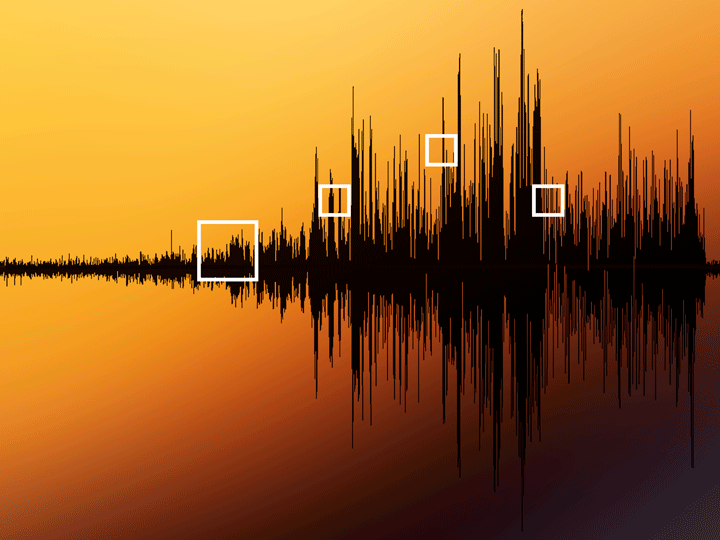
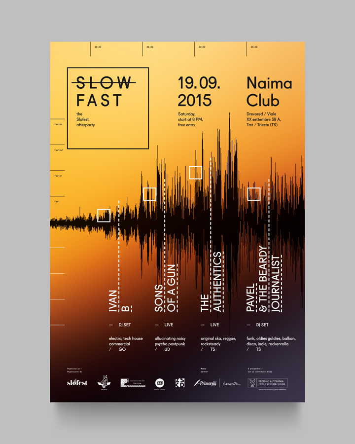
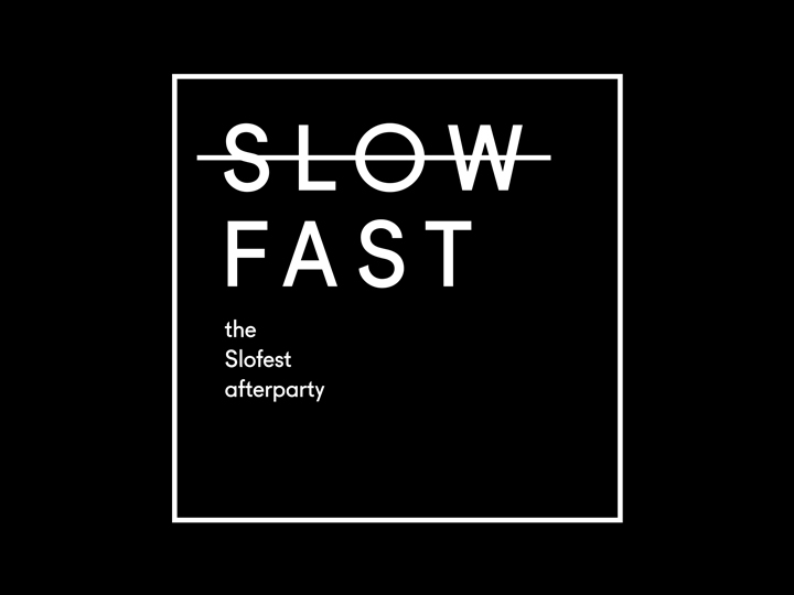
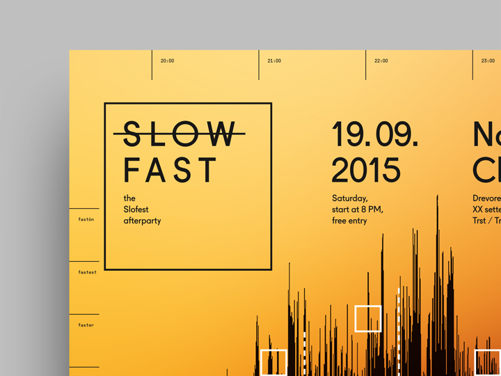
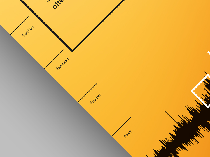
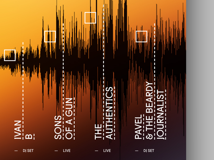
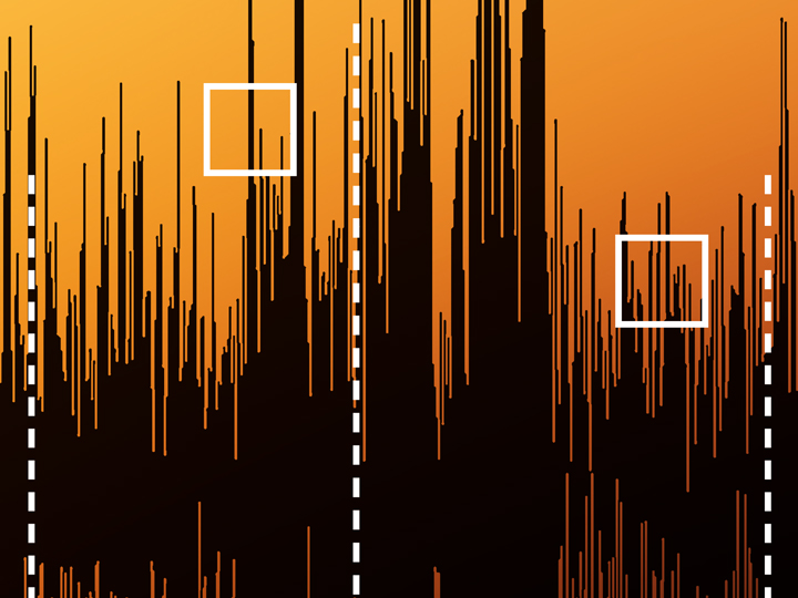
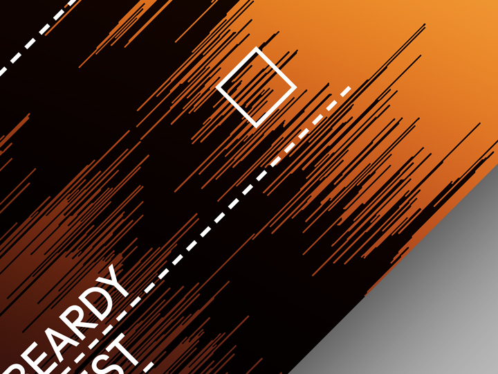
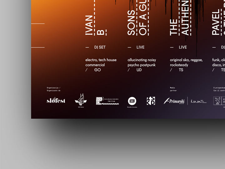
The ‘Slow / Fast’ naming was chosen as the right one for the afterparty — a night-time event with dj sets and live music located in a Trieste notoriuos club — because of its assonance with the ‘Slofest’ name, giving in this way to the whole thing a ‘clubbers mood’ and a young-target ‘cool’ appeal. In the poster that I designed for the event, the ‘Slow / Fast’ naming is represented graphically as ‘partially erased': the word ‘Slow’ is strikethrough because of the vivacity of the party — underlining in this way the ‘Fast’ and joyful developement of the occurrence. Also the whole concept of the visual design is inspired here by the words ‘Slow’ and ‘Fast': the structure of the poster-sheet is created as a paper (colored with warm tints to emphatize the heat of the happening) used by seismometers and seismographs to measure the motion of the ground generated by earthquakes. For this reason some thin lateral bars are displayed on it — horizontally representing the time lapse and vertically representing the intensity of the waves (going from fast to faster to fastest to fastòn, that is a slang word in the dialect of Trieste to describe a hyper-party level) — and a seismogram is drawn onto the cartesian axes (growing in the X and Y axes in parallel with energy released by the party in progress). Four white squares are placed onto the seismogram-draw, representing the peaks of the party-shakes, connected with the dj’s and bands’ performances in the time lapse of the event.
This ‘technical’ seismometry-factor is understandable if one looks at the poster closely. When viewed from far away, the seismogram-drawing and the coloring of the layout recall the skyline of the city of Trieste, kind of as reflected in the Mediterranean sea in a beautiful summer-end’s sunset.
Credits
Creative direction → Aleš Brce
Art direction → Aleš Brce
Graphic design → Aleš Brce
Year → 2015