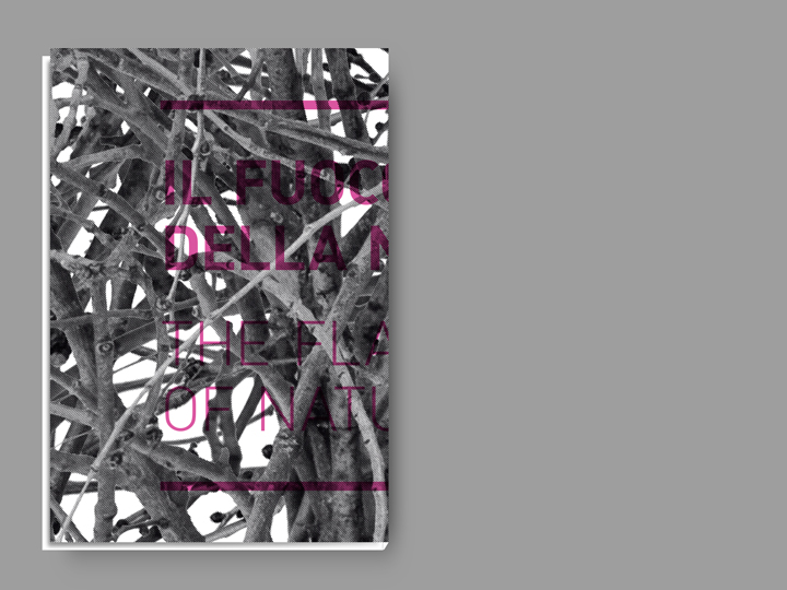
Il Fuoco
della Natura
Art direction ✓ Exhibition design ✓
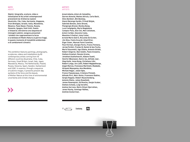
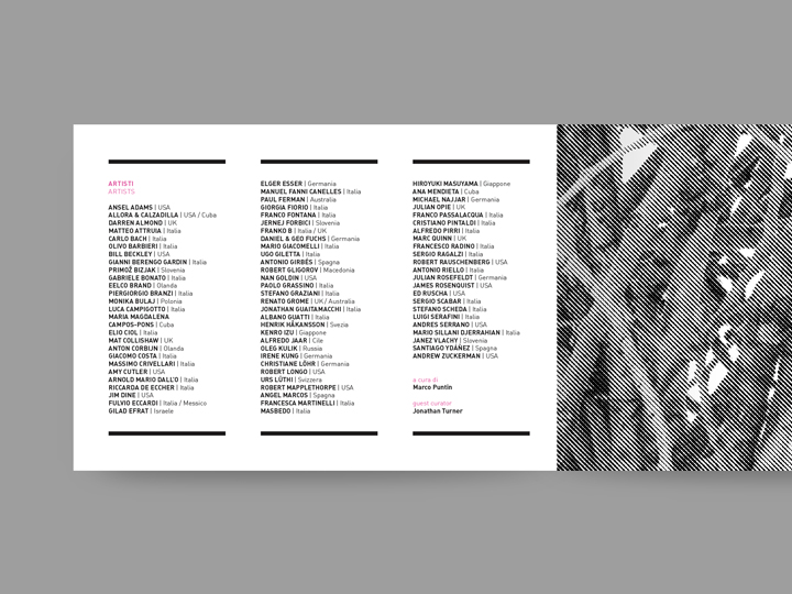
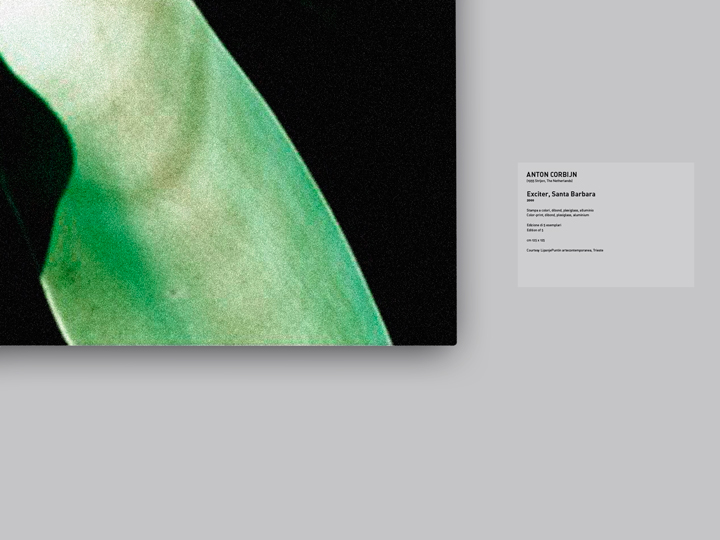
‘Il Fuoco della Natura’ was an international art exhibition that took place in Trietse (Italy) in 2012. Translated from italian as ‘The Flash of Nature’, the exhibition (curated by Marco Puntin and Jonathan Turner) featured paintings, photographs, sculptures, videos and installations by 82 contemporary artists coming from 18 different countries and — in essence — presented through a sequence of sublime images the present-day symbols of the force and the beauty of Mother Nature. Through the eyes of famous international artists (such as Anton Corbijn, Robert Longo, Mat Collishaw, Gianni Berengo Gardin, Kenro Izu — just to name a few) ‘Il Fuoco della Natura’ showed animals, plants and the natural world in all its splendor, beauty, power and perfection. The choice of the theme was determined by the conviction that Nature as a subject represents the ideal mediation between the art world and the viewing public. Realistic imagery produced by contemporary artists provided an instantly recognizable map of the natural world, free from changes in fashion or the technological input of man.
So the ‘Flash’ word in the english version of the exhibition’s name was intended as an evocative word for the exhibition’s concept itself: a blaze of creativity that deals with environmental uncertainty and climate change. Otherwise ‘Fuoco’ is the italian word for ‘Fire’. Fire can completely destroy things. Fire destroys things, but Nature gave them life again, through a rebirth. So the word ‘Fuoco’ gave to our art direction of the exhibition comunication and design (the creative team included myself, Giovanni De Flego and Michele Zazzara) also a futher interpretation to the exhibition’s concept.
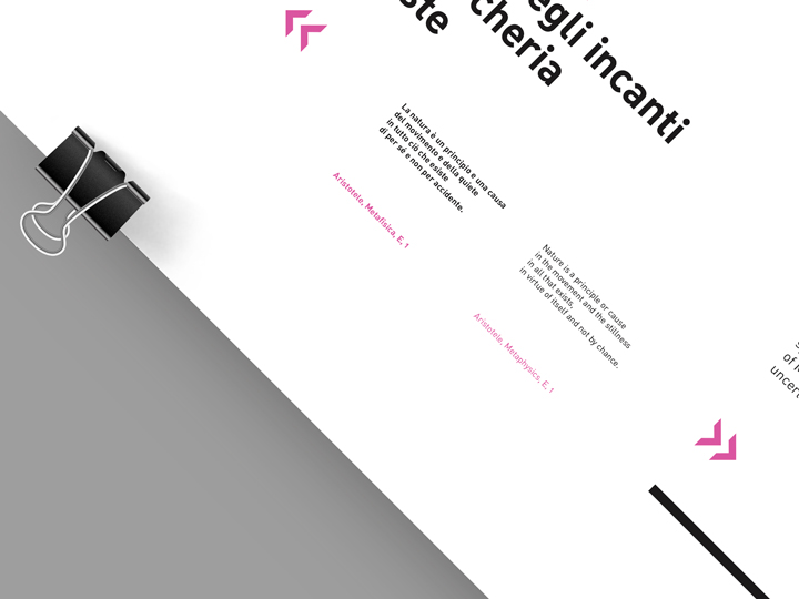
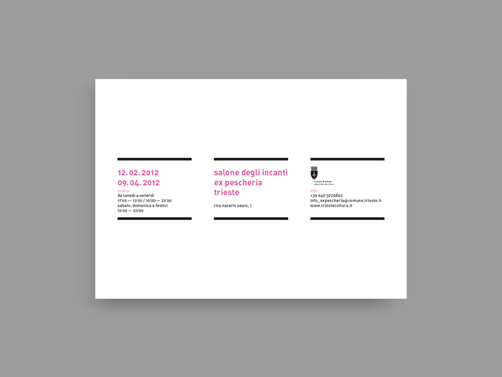
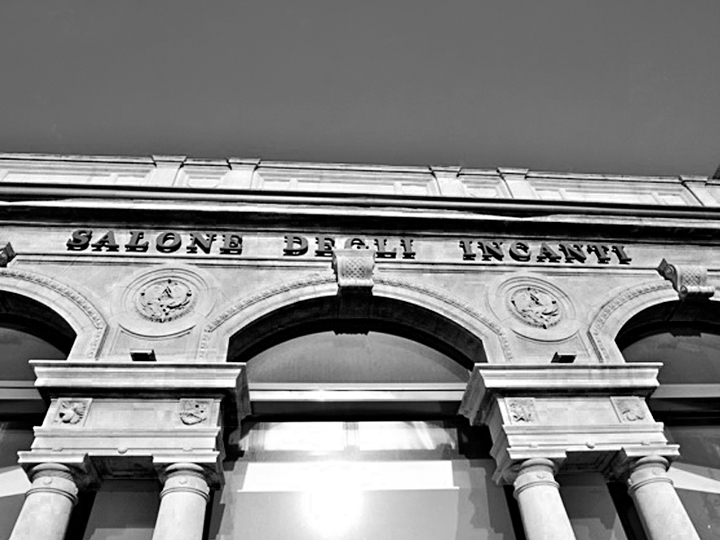
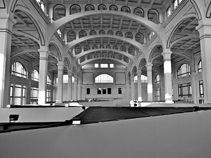
The event took place in the Trieste ex Fish Market — a beautiful and pretty symbolic building of the city — restyled as art exhibition space (named ‘Salone degli Incanti’ — literally translated as Salon of Enchantments). During the years the re-valued construction faced several challenges: the city county in fact considered the hypothesis to change the artistic purpose of the edifice. ‘Il Fuoco della Natura’ was so supposed to be a sort of last exhibition taking place there. Therefore the two curators wanted to show that there was still need of art ‘in it’ and that this suggestive place was necessary for the city of Trieste to be an art-holder.
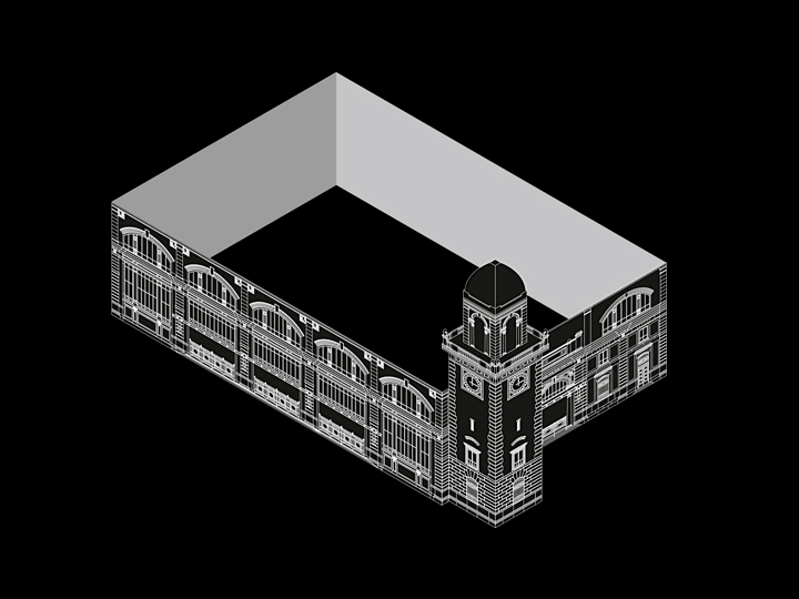
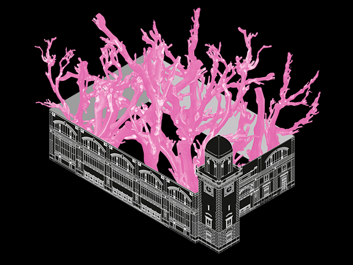
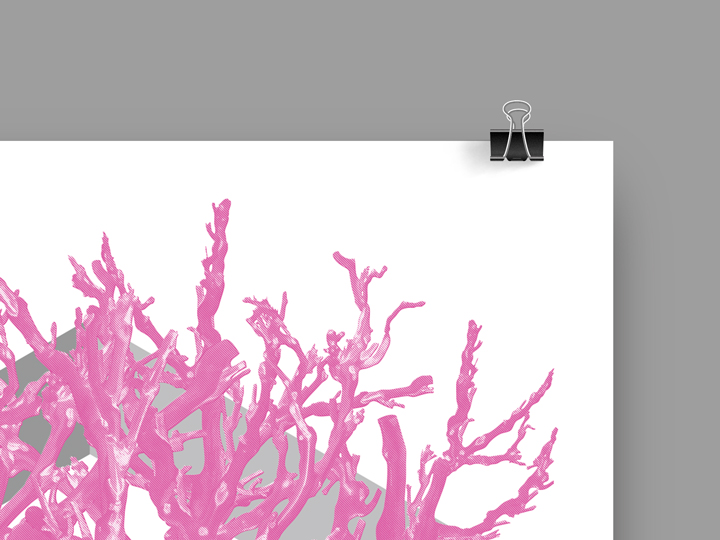
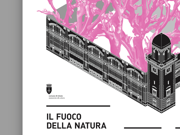
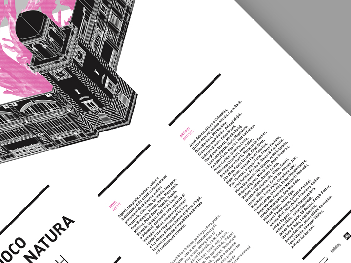
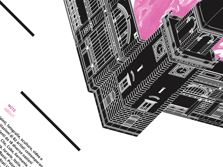
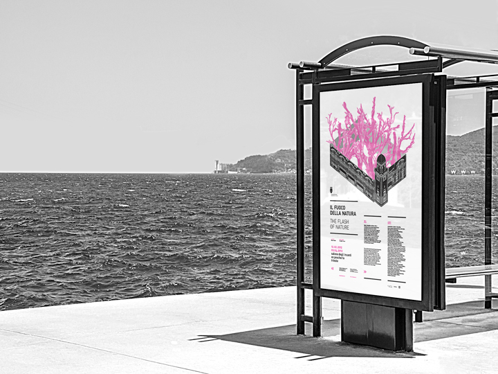
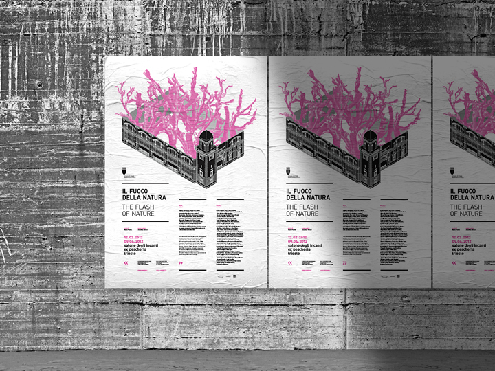
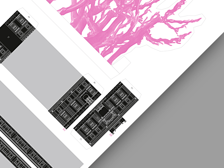
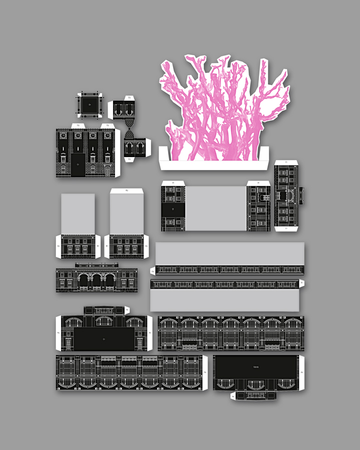
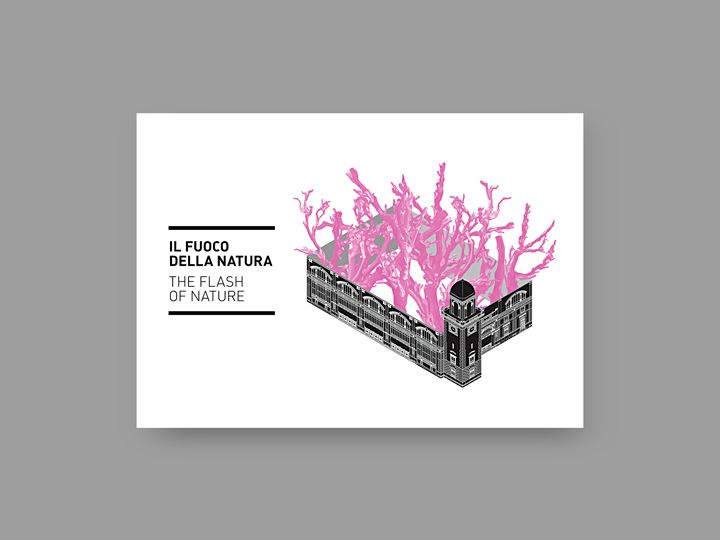
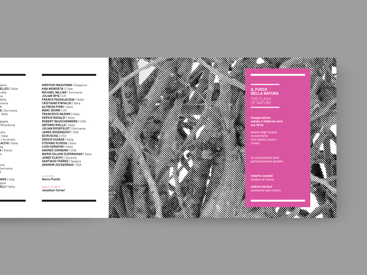
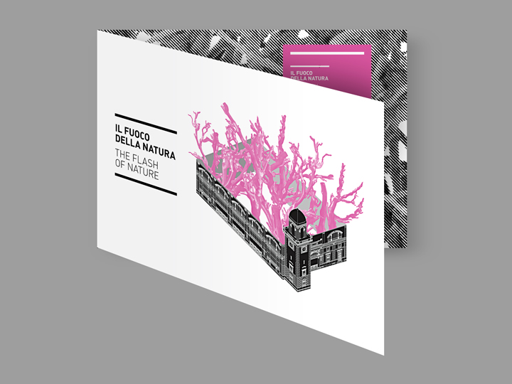
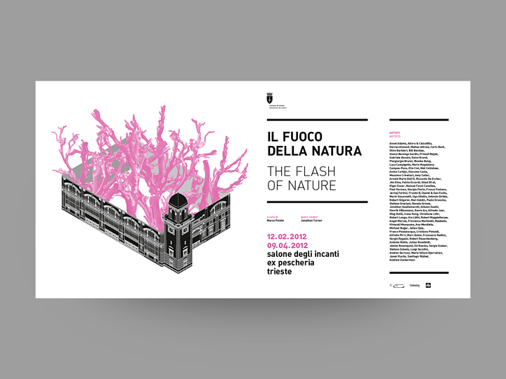
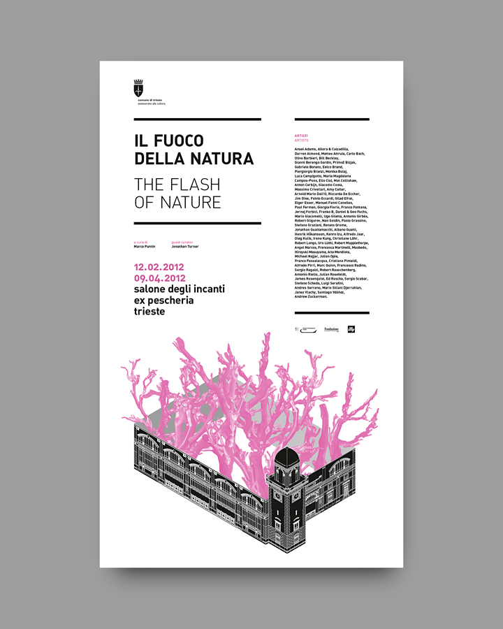
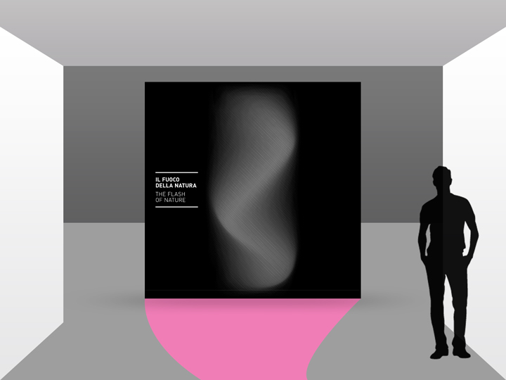
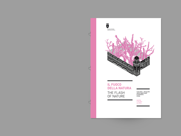
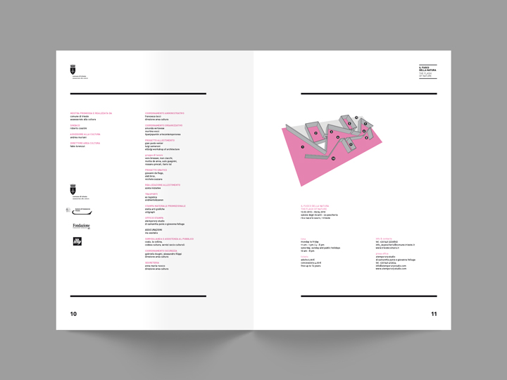
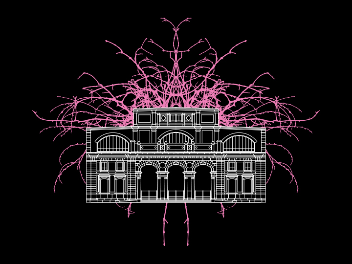
So we interpreted this ‘local issue’ as the rebirth of plants after the burning, or — simbolically — after the decision to tare the place down. This is one of the main reasons why we decided to use trees and/or tree branches that growns and explode inside the historical building, trees that surrounds the area close to the ex Fish Market. A ‘Pink Nature’ (color chosen by the curators for its vividness and freshness) emerges from an axonometric projection of the ex fish market building (scrupulously vectorially designed), rising up to the sky — imposing, as the power of Nature.
We designed — in this mood — all the promotional materials for the exhibition (two color printed posters, flyers, paper toys, rsvp invitations, jumbo billboards, the street banners, the press kit and the whole merchandising) and the exhibition communication (colophon and map totems, the entrance hall floor decor, informative totems, the exhibited operas captions). All in a pretty iconic and recognizable way, remarking through our design both the environmental concept of exhibition and the importance of the exhibition area itself.
The ex Fish Market as a container of Nature, the ex Fish Market as a container of art.
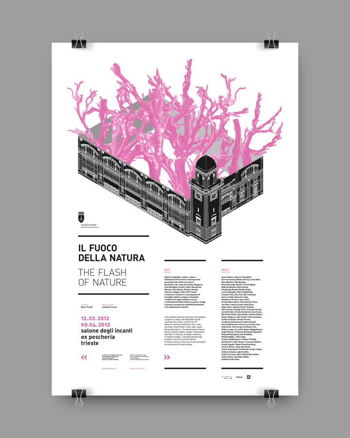
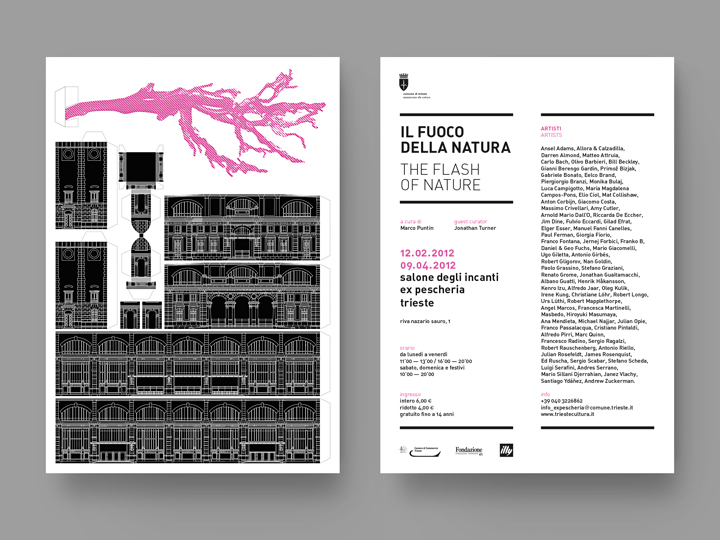
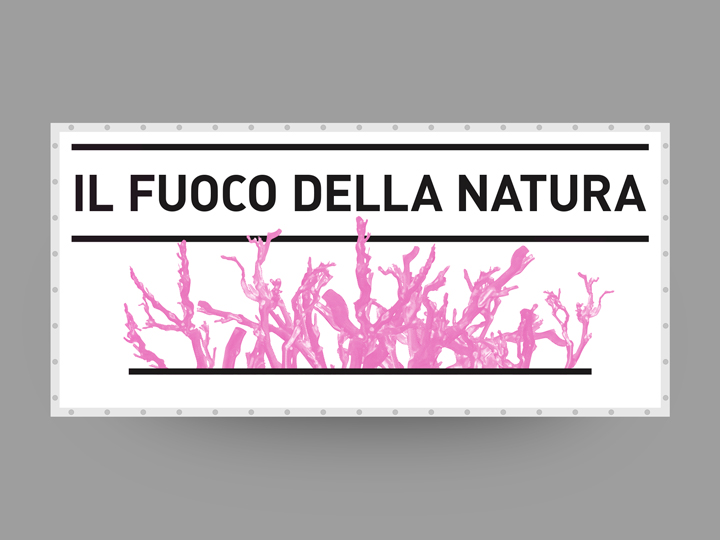
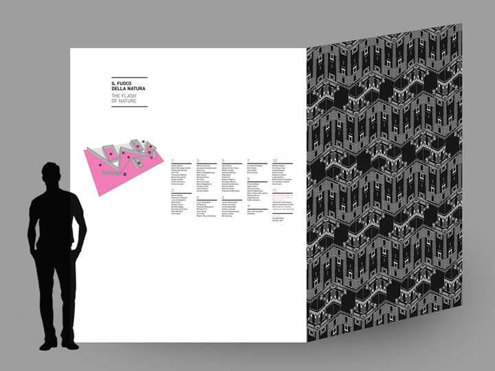
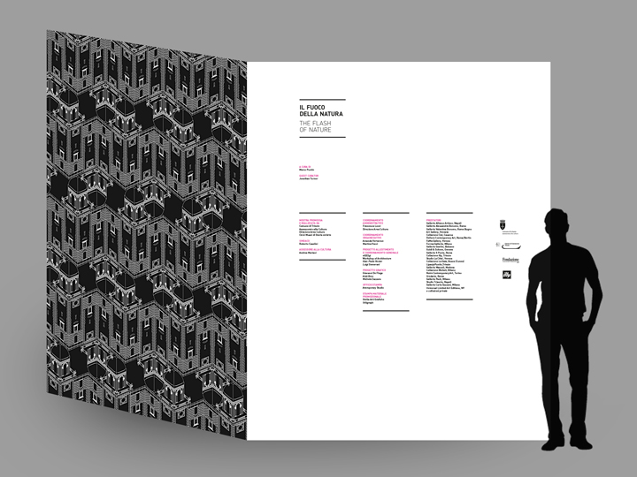
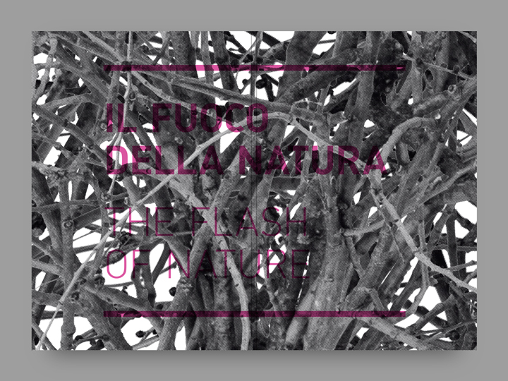
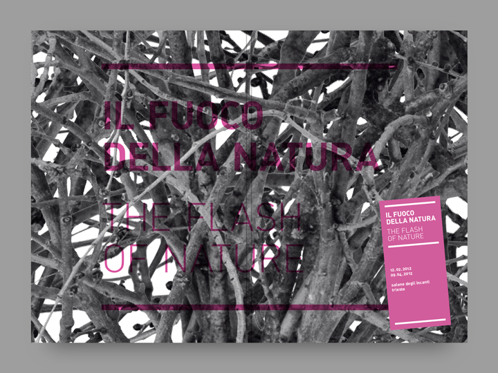
The poster
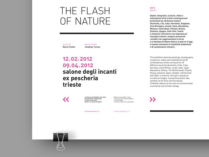
The poster for the exhibition was printed in two colors: a pink plus a black Pantone. We made two different sized versions of it: some limited edition 70 x 100 cm gift copies (printed on 150 gr. ice white uncoated paper) and much more 100 x 140 cm ‘street-stuck’ copies (printed on thin economic paper). There is a short presentation of the exhibition on it, accompained by the complete list of the artist exhibited, as well as the event data and placement and al the informations.
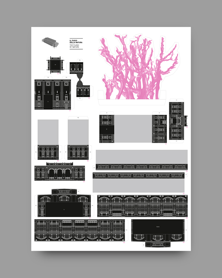
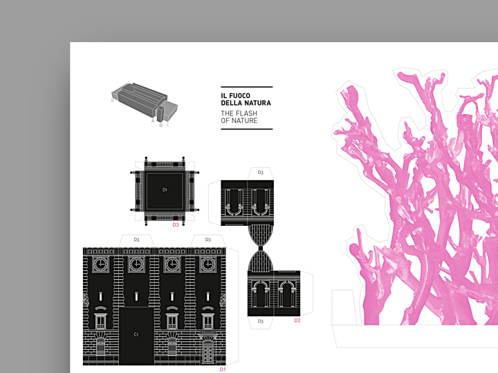
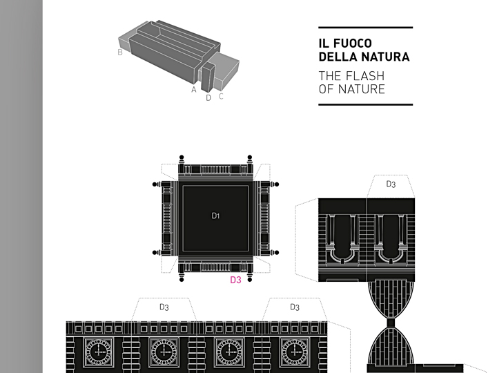
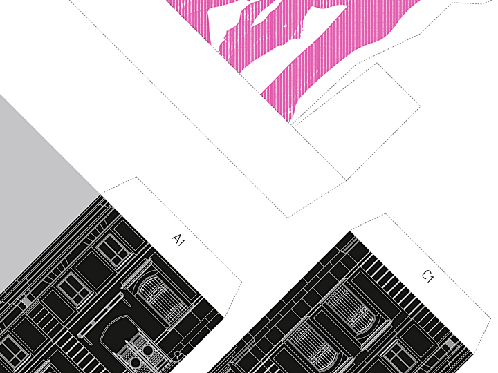
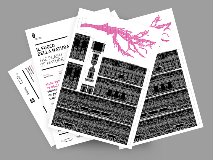
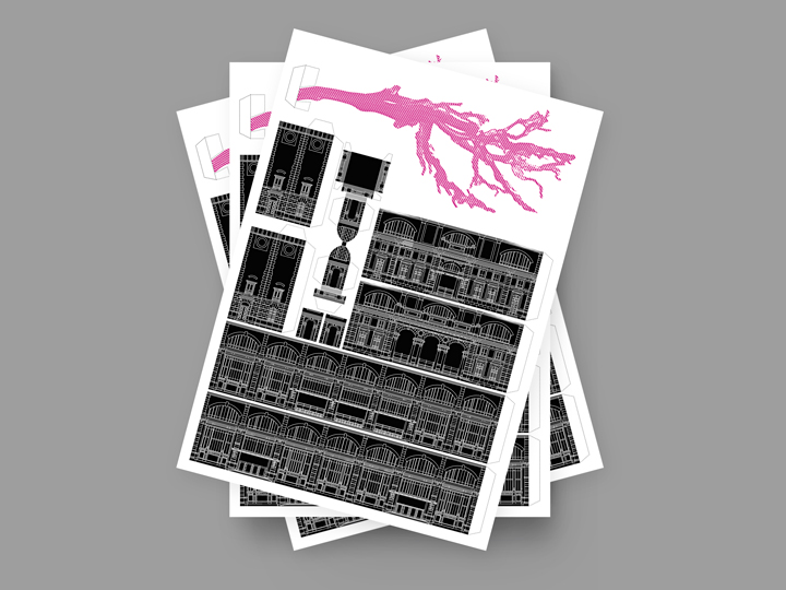
The paper toy poster
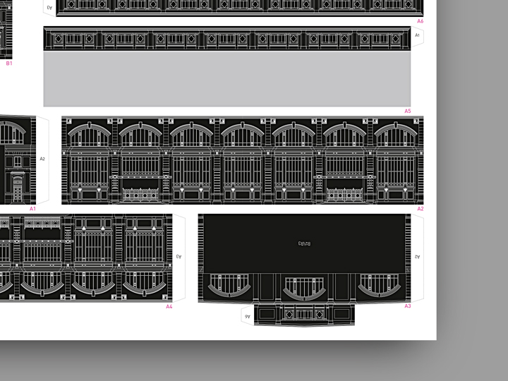
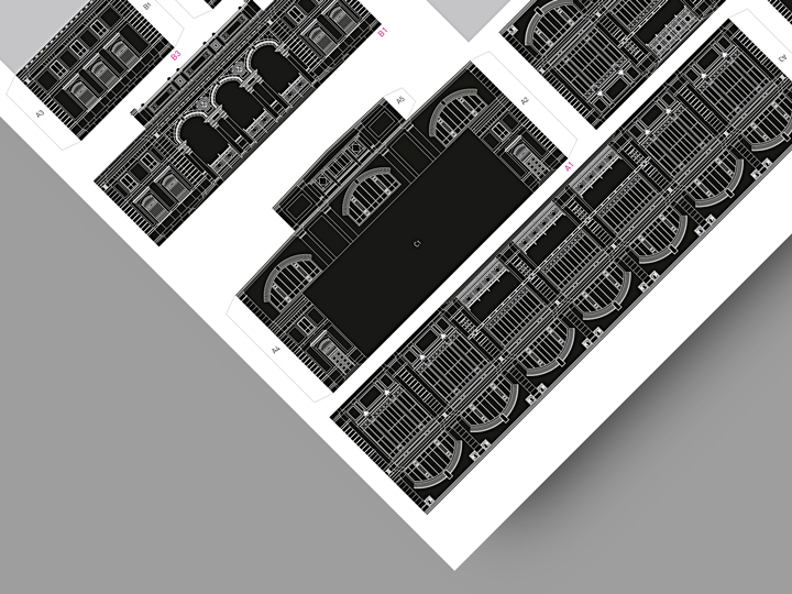
To remark the spirit of the exhibition we decided to design a paper toy — delivered to the visitors — to recreate the ‘Salone degli Incanti’ (the ex Fish Market) and keep alive the message of ‘Il Fuoco della Natura’ also once the visit of the viewers ended. A 50 x 70 cm poster (two colors printed on a 150 gr. ice white paper) to be cut, to be folded and to be glued into the shape of the exhibition’s area.
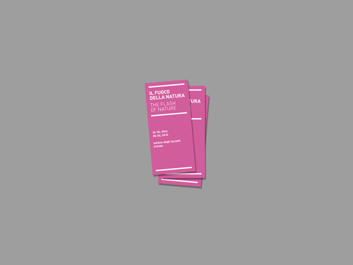
The flyer
A small paper toy’s version is available also on the exhibition’s flyer. A redux version of the ex Fish Market to be built (cut, folded and glued) — displayed on the A5 piece of paper’s front — accompanies the event informations and the list of artist featured in the ‘Il Fuoco della Natura’ — on the flyer’s back. Printed in two colors on a 150 gr. ice white paper.
The rsvp invitation
The folded Répondez s’il vous plaît invitations for the exhibition opening, featuring the ‘iconic’ ex Fish Market ‘container of pink plants’ on the front and a lumber close-up capture on the inside. A pink box there highlights the official invitation from the city authorities.
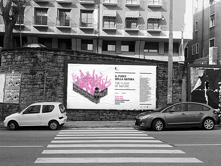
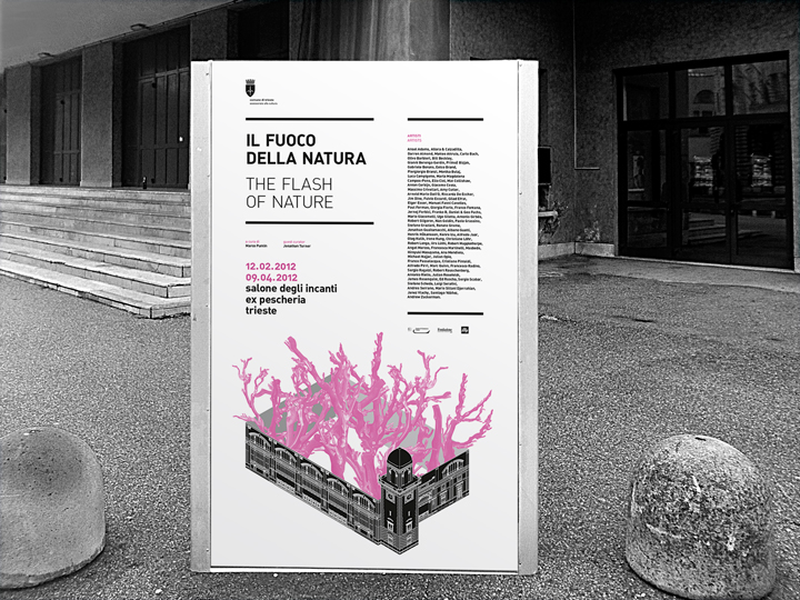
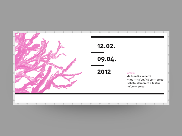
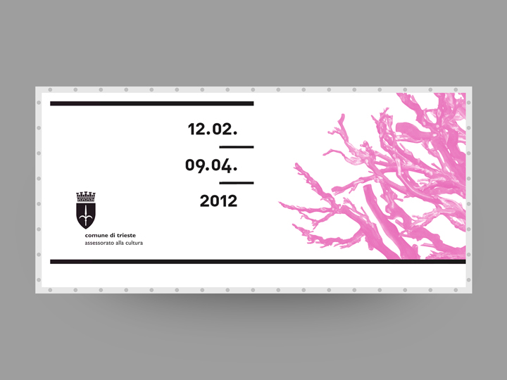
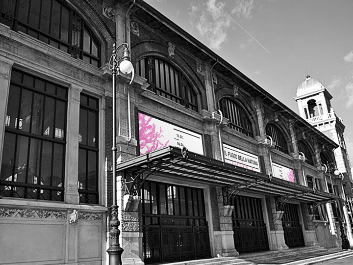
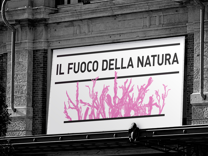
Jumbo and street banners
To promote the ‘Il Fuoco della Natura’ exhibition we prepared also a bunch of 6 x 3 m jumbo billboards and some 120 x 200 cm adesive ‘stand-up’ street banners. The materials were placed all over the city of Trieste.
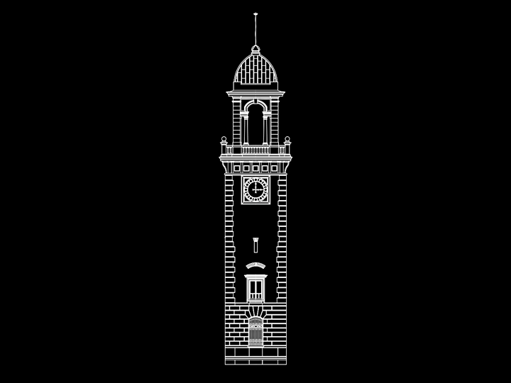
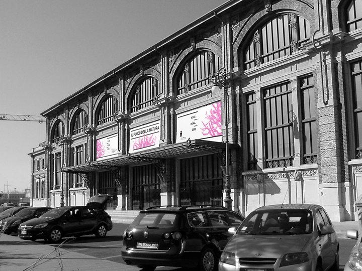
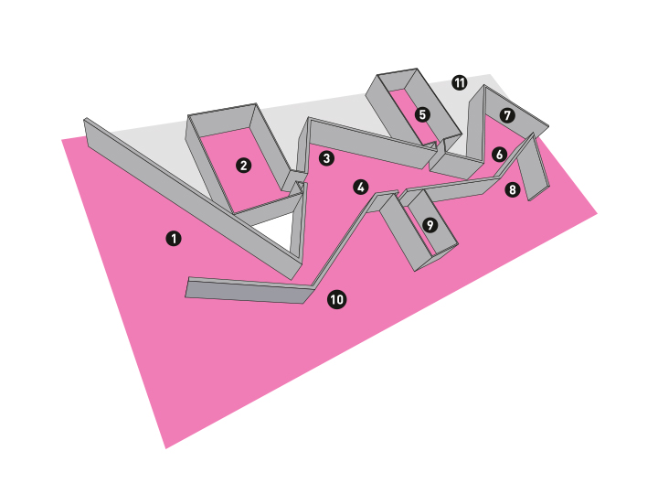
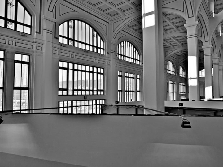
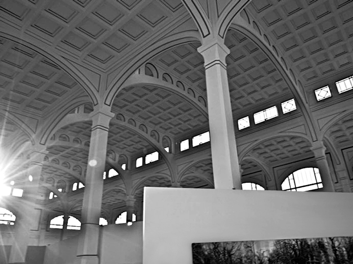
The ex fish market
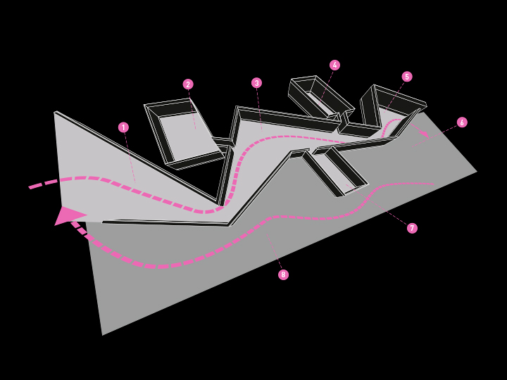
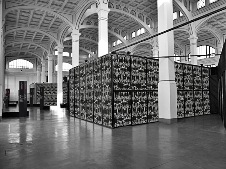
Set of three horizontal banners promoting the ‘Il Fuoco della Natura’ exhibition, placed onto the ‘Salone degli Incanti’ facade (on site). The building, a masterful example of eclectic architecture and technological experimentation of new materials, was inaugurated and opened to the public on 1913 as the Central Fish Market of Trieste. The edifice maintained its original function of market until the beginning of the new millennium (from 1933 the side-wing, originally intended to cold rooms, is hosts the Civic Marine Aquarium). Since 2006, after a restructuring aimed at recovery and preservation of the building, the building is home to major cultural exhibitions and events, including — in the large exhibition area — a conference hall (auditorium) with 99 seats, a bookshop and a rooftop terrace.
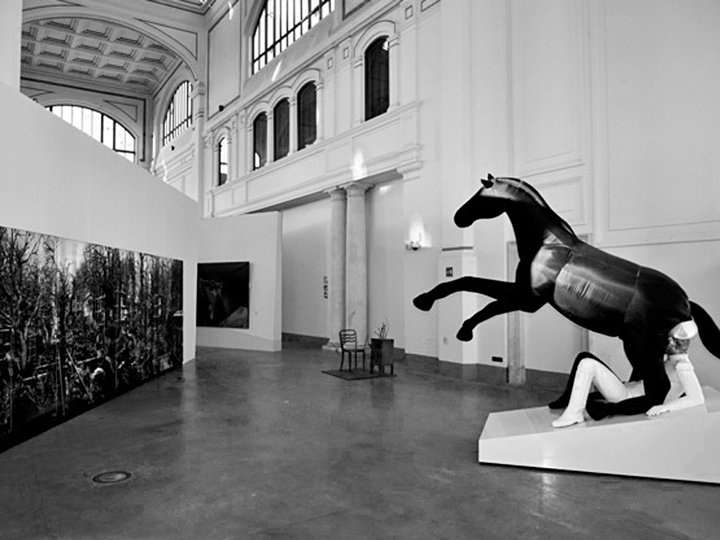
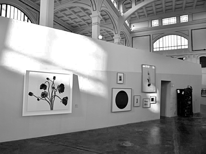
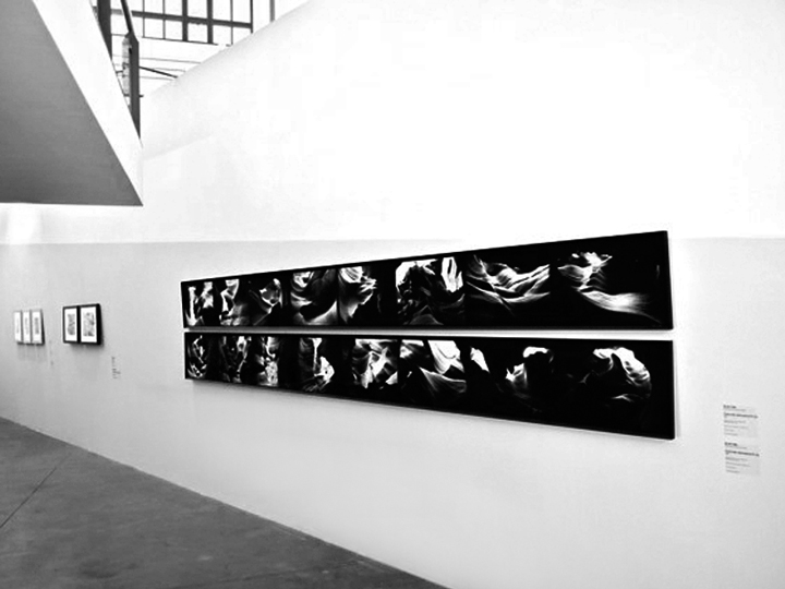
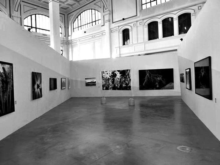
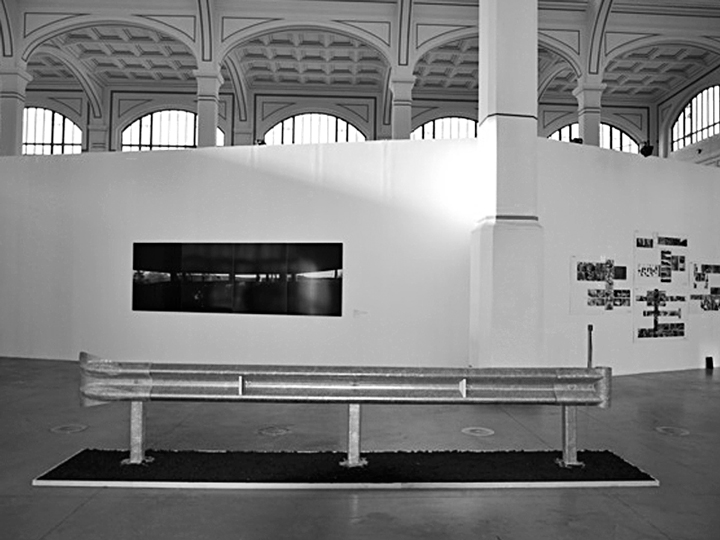
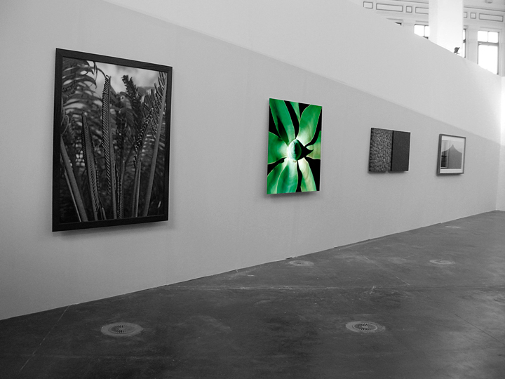
The exhibition design
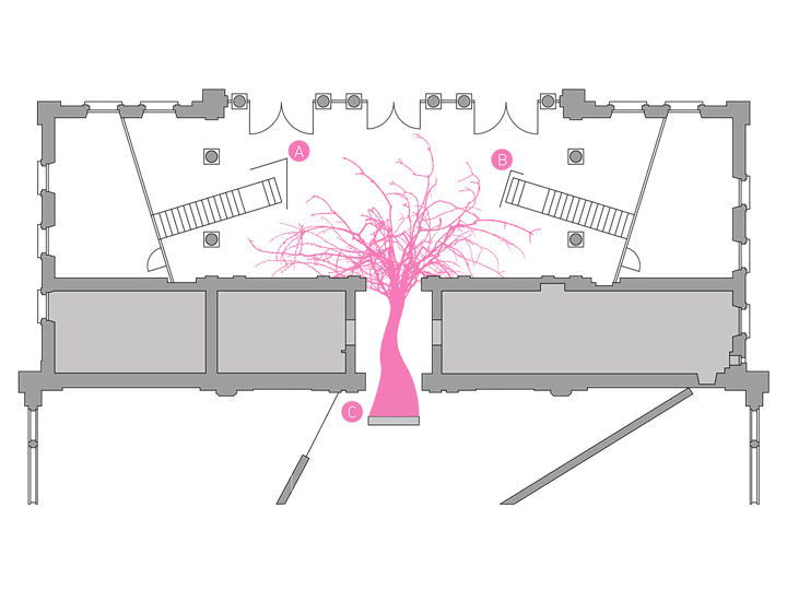
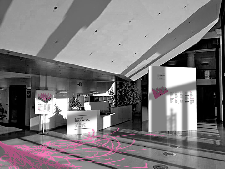
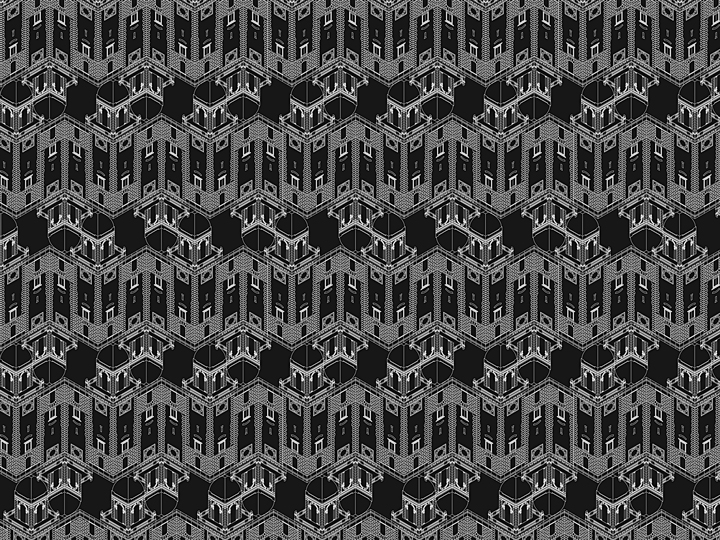
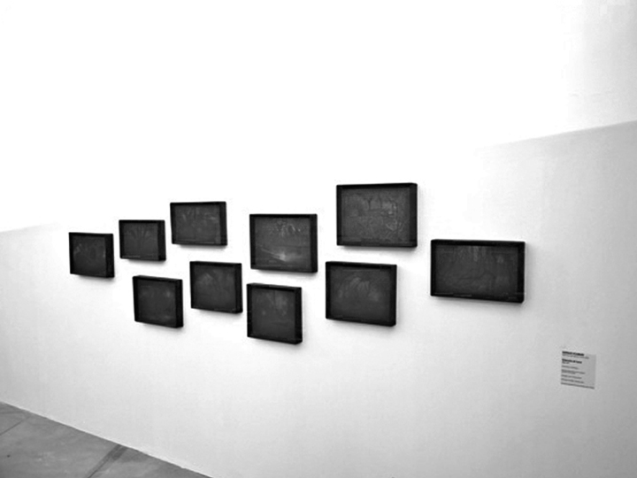
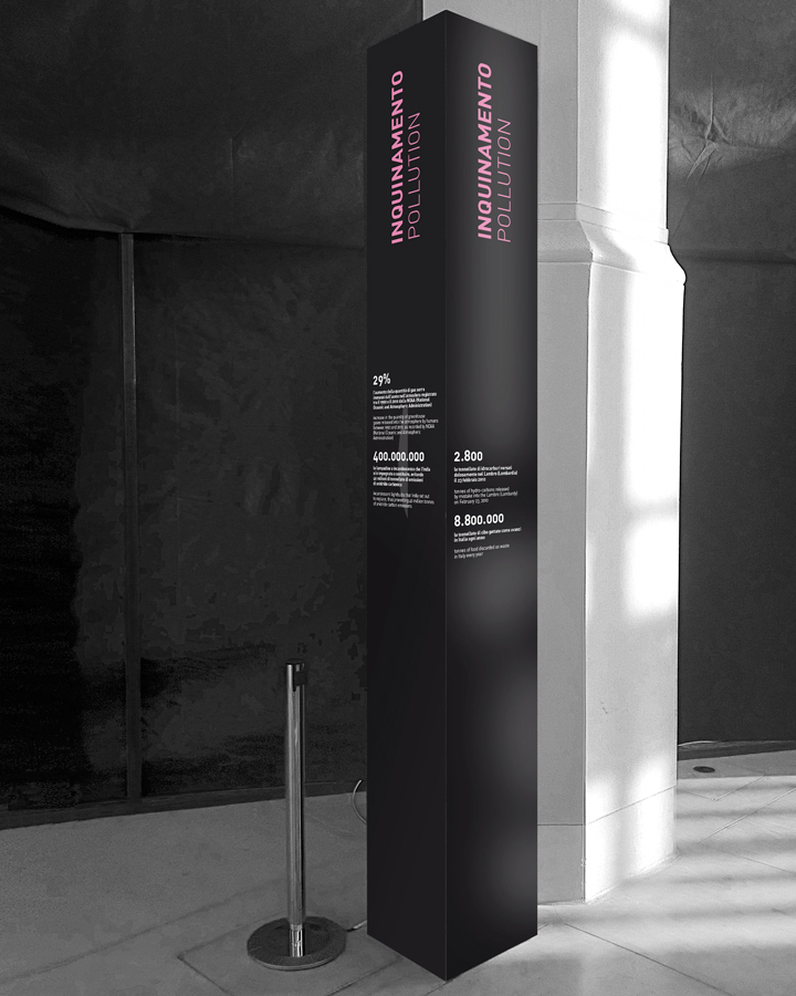
The exhibition area inside the ex fish market. In the atrium, a huge tree-growing ground adhesive welcomed the visitors, inviting the crowd to enter the exhibition. In the atrium there were also two big totems displaying the colophon and the exhibition map. Many small ex fish market facade-textures created a optical pattern on them, while the info, tickets and merchandising desk was placed between those two panels. Another totem there, a little more inside, features a s’tylized smoke treatment ‘ symbolically caused by the ‘Fire of Nature’ that was developing itself just by stepping a little bit onwards. The inside-exhibition area was created by architect Gian Paolo Venier.
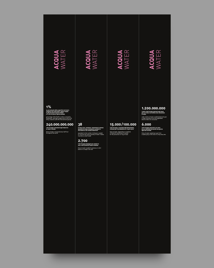
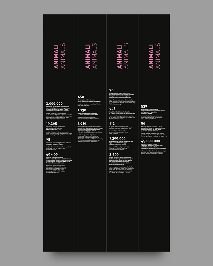
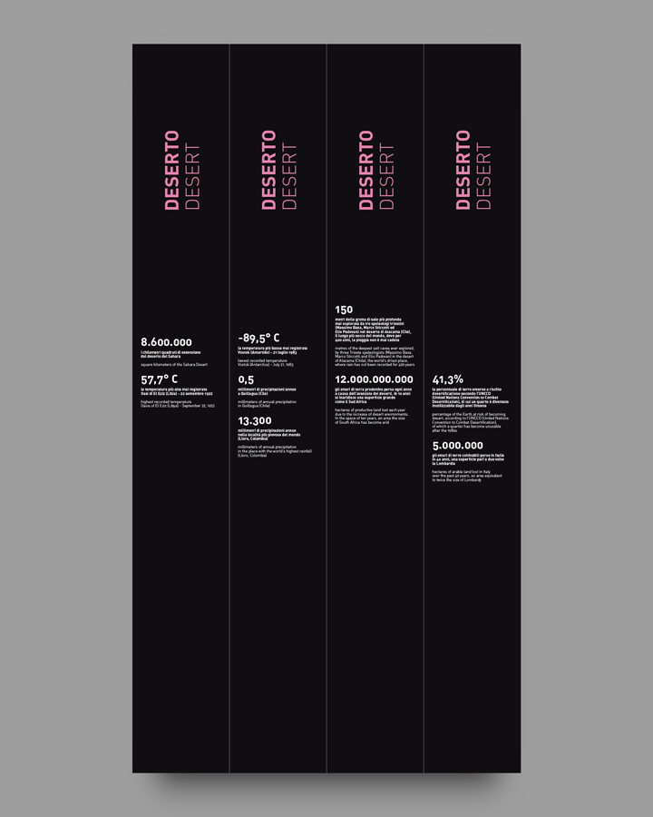
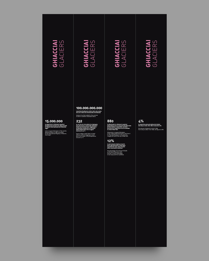
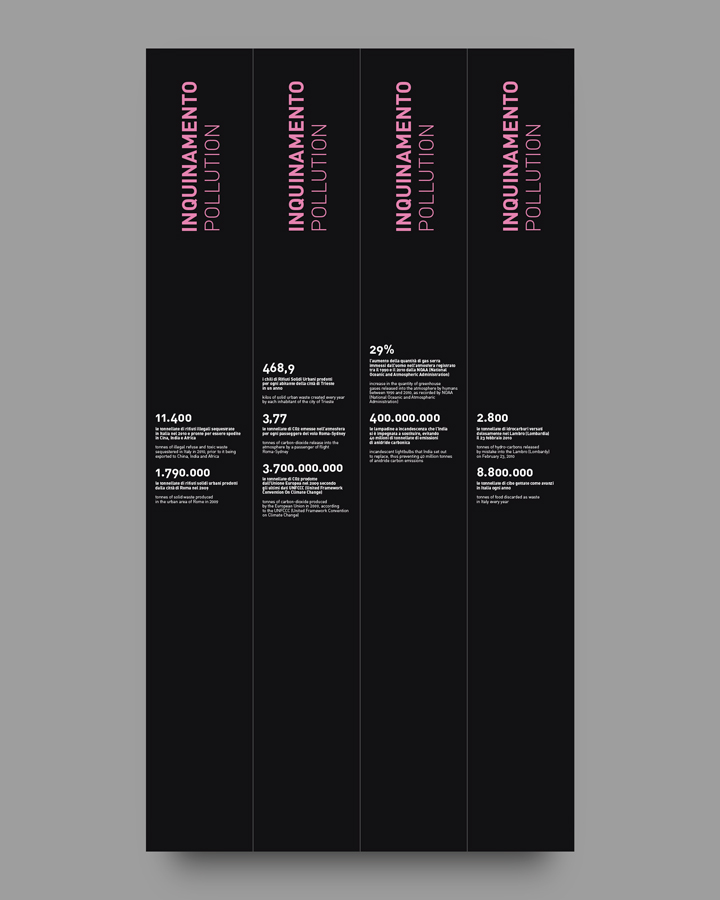
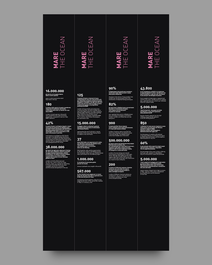
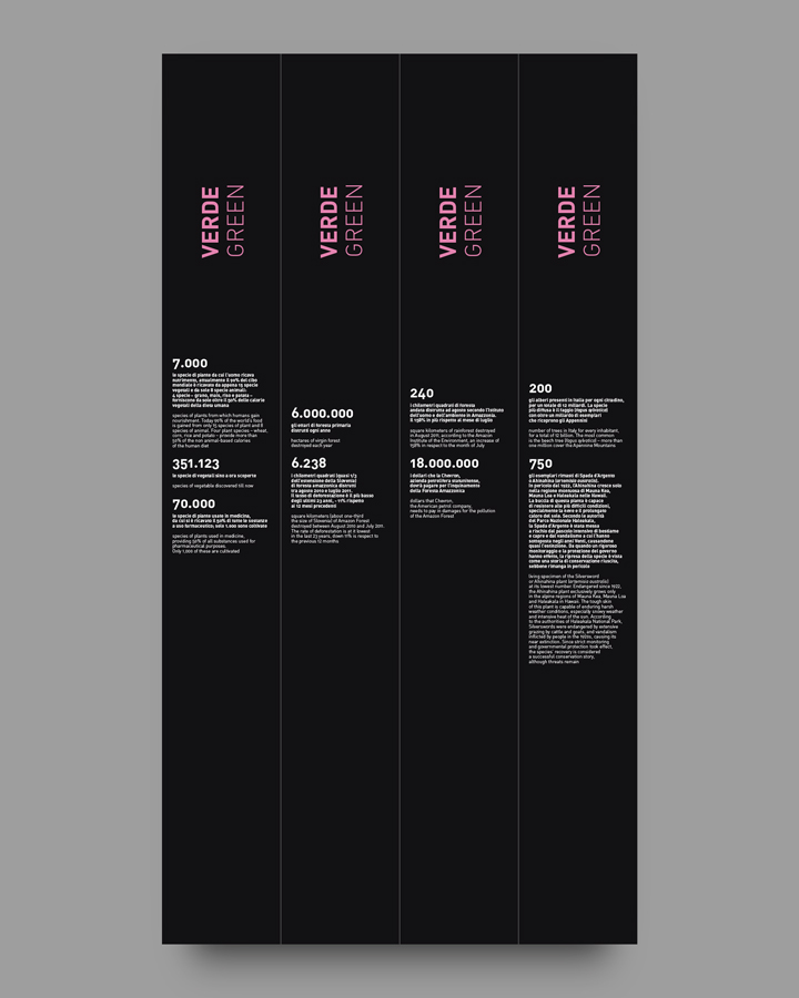
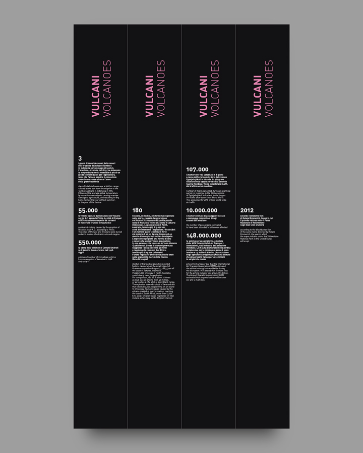
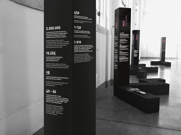
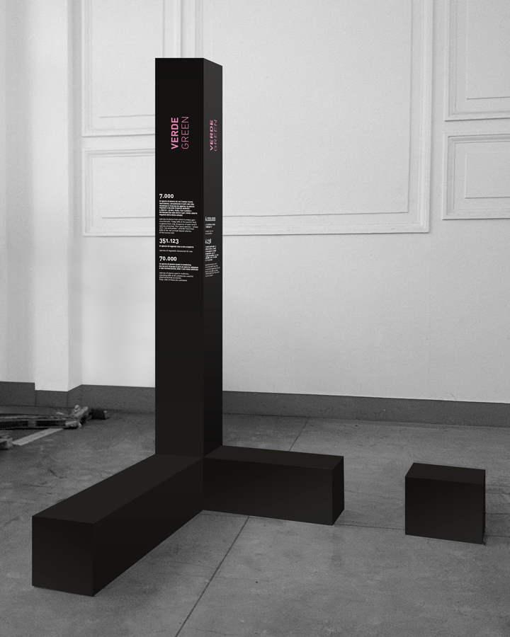
The Numbers of Nature
All around the exposed visual imageries created by the exhibition-featured artists there were standing eight black totems (water, animals, desert, glaciers, pollution, ocean, green, volcanoes) displaying some ‘Numbers of Nature’. On them there were numbers and descriptions of how evolution has its own slow pace, but man’s intervention with nature can be sudden, radical, disruptive and sometimes seemingly permanent. Nature can bounce back in surprising ways. So, alongside the aesthetic criteria behind the selection of specific paintings, photographs, installations and videos, in ‘Il Fuoco della Natura’ those totems posed ethical questions directly linked to the works exhibited.
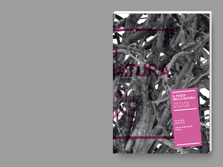
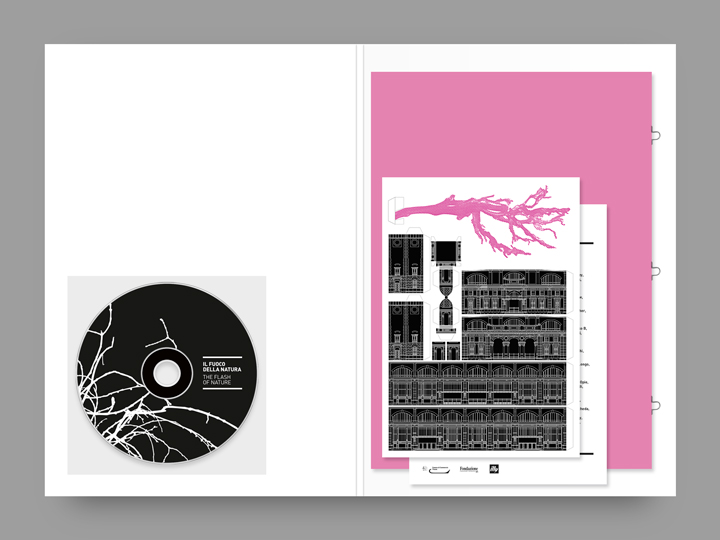
The press kit
A packaged set of promotional materials of the exhibition, distributed to members of the media for promotional use. Included a press release brochure (in four languages), curators biographies, a multimedia disc with all the exhibited artist’s informations and photographic galleries.
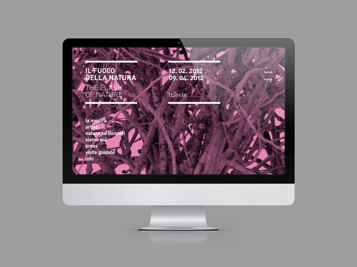
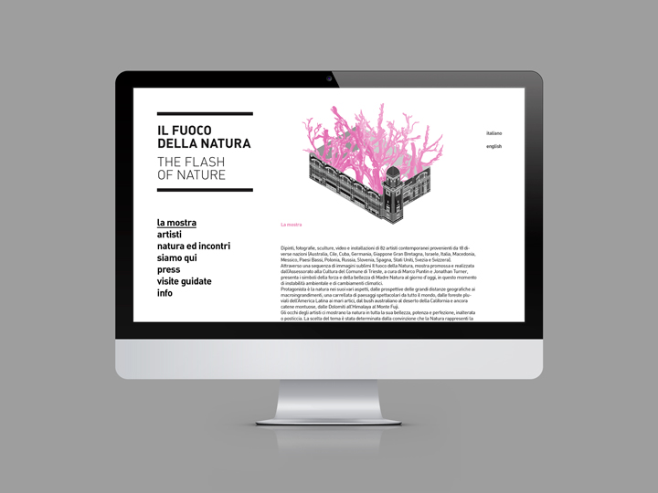
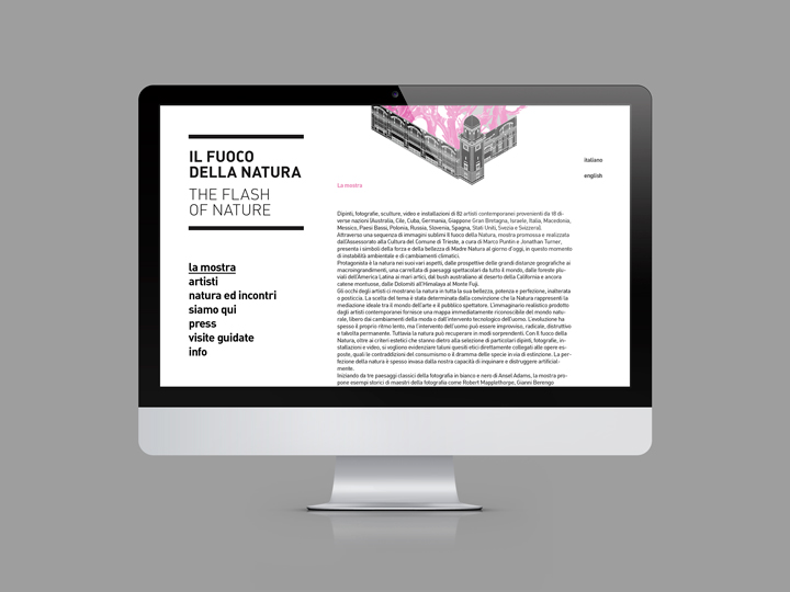
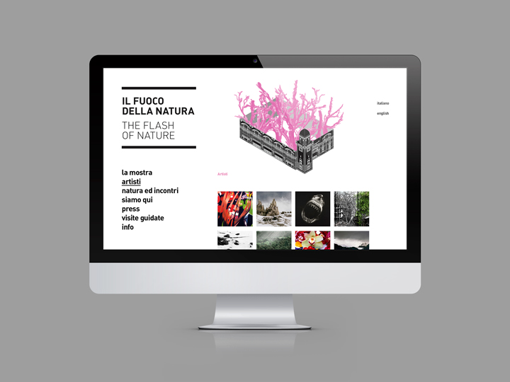
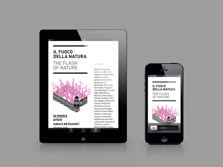
Multimedia
Structures for web promotion and online communication for ‘Il Fuoco della Natura’. The responsive website concept reflects the printed matter promotional materials layouts. A clean and easy-to-navigate graphic interface.
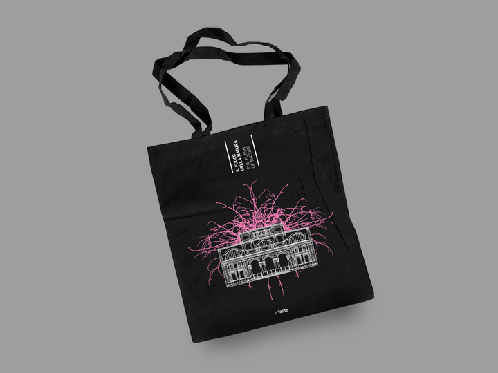
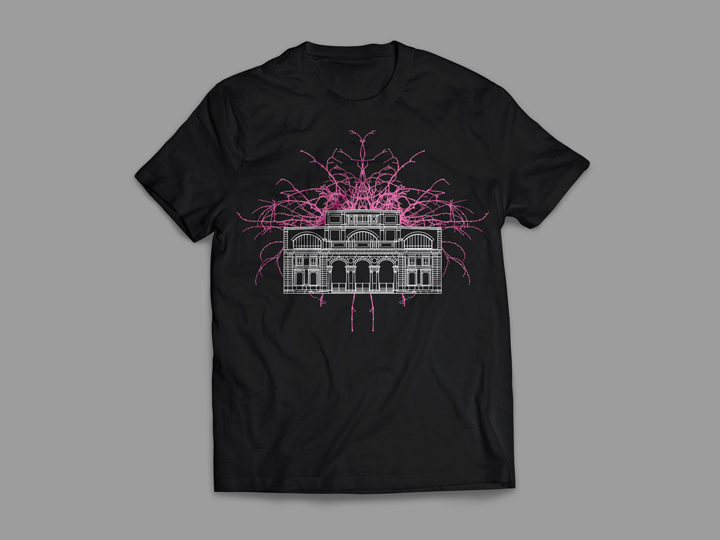
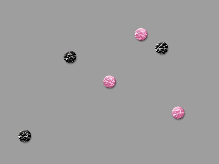
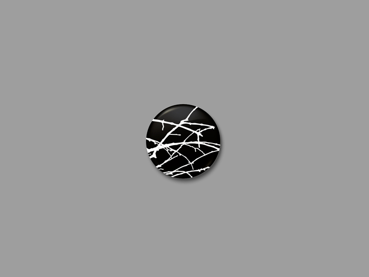
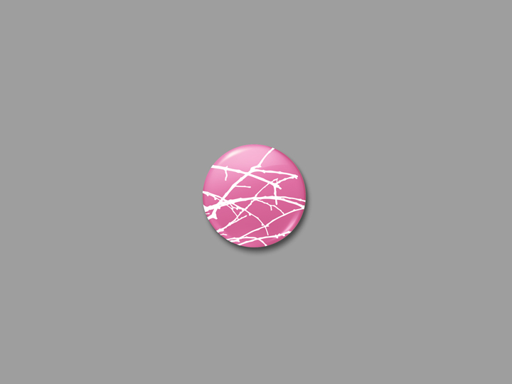
Merchandising
A variety of products available for sale: black cotton tote bags, t-shirts and pins. The ‘trees explosion and Fire of Nature developement inside the ex-fish market’ is — also here —the main design element.
Credits
Creative direction → Aleš Brce, Giovanni De Flego, Michele Zazzara
Art direction → Aleš Brce, Giovanni De Flego, Michele Zazzara
Graphic design → Aleš Brce, Giovanni De Flego, Michele Zazzara
Photos → Arnon Debernardi
Year → 2012