Karburo
— Self titled album
Music ✓
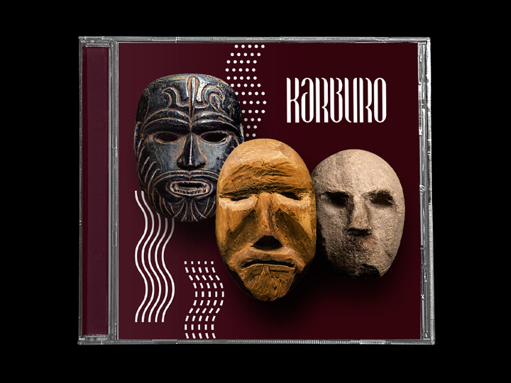
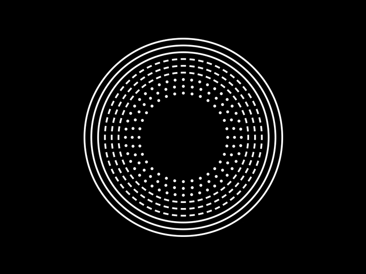
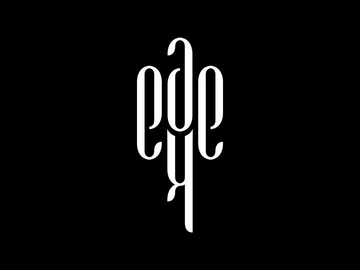
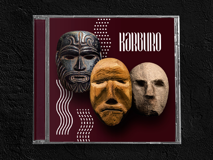
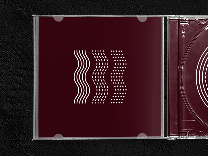
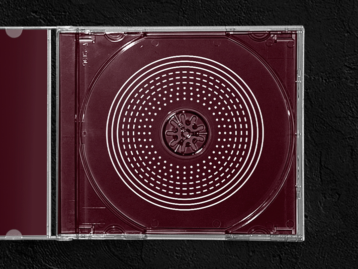
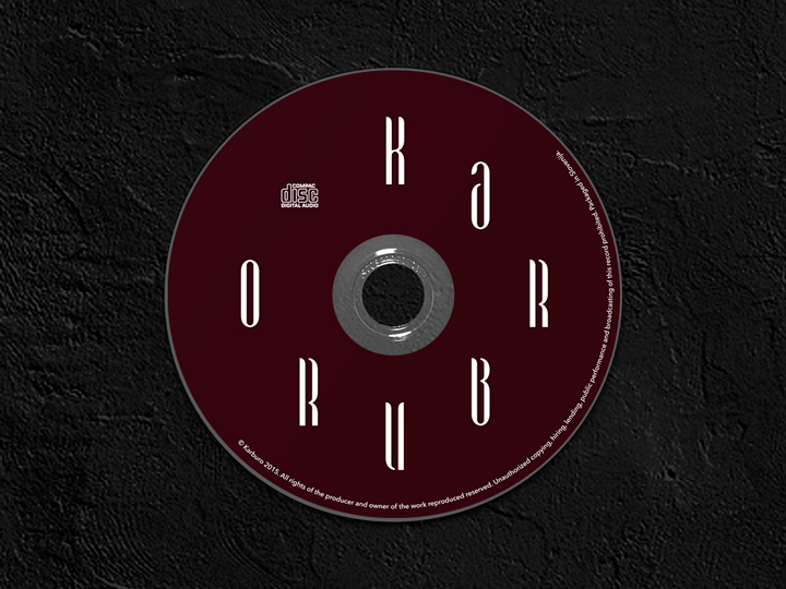
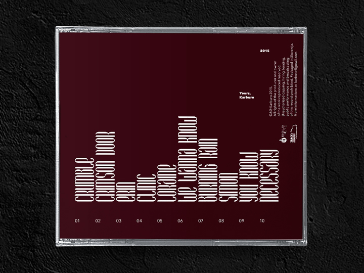
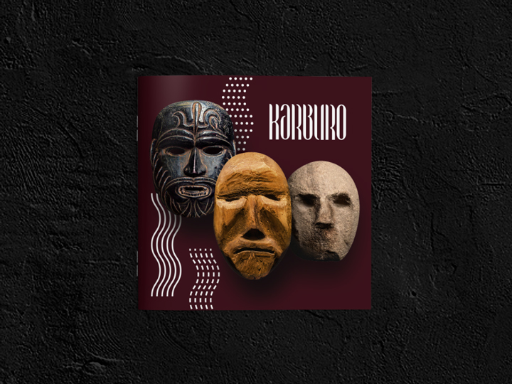
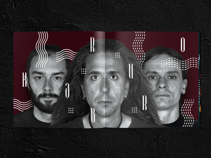
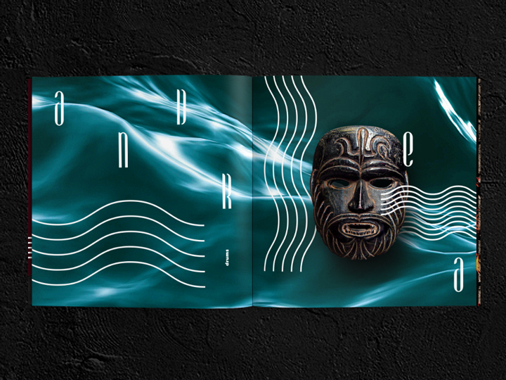
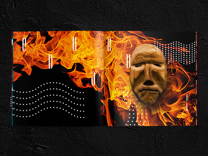
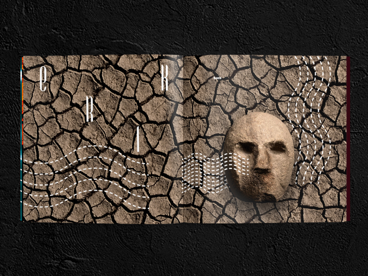
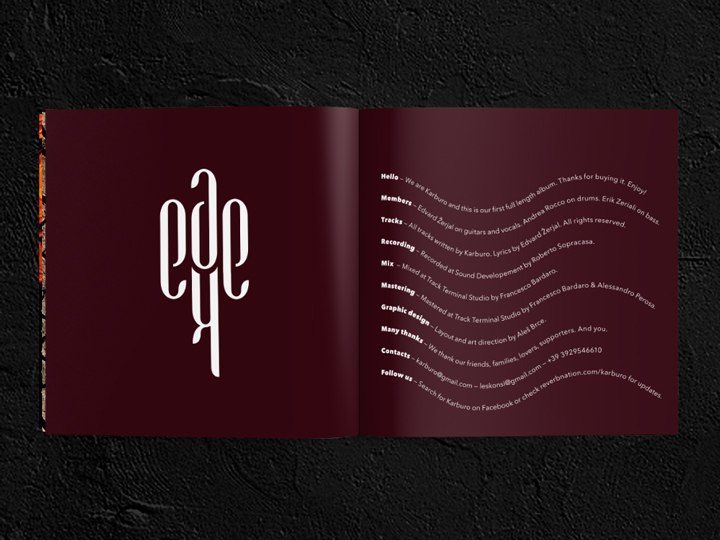
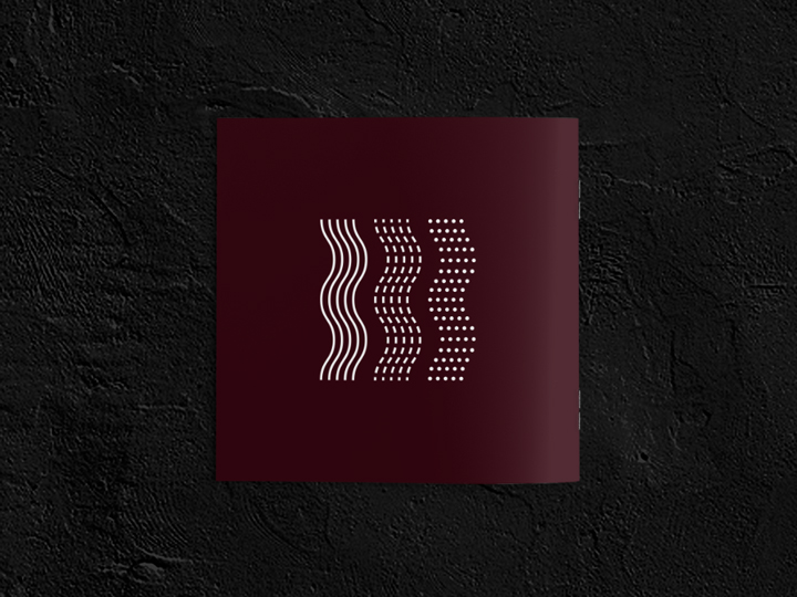
Karburo is a rock band strongly conceptually inspired by shamanism, magic immaginary and nature. For their self titled album I designed a mahogany-coloured and tribally-conceived layout that reflect the band members ‘mystical passion’. Everything is developed around the modeling of three shamanic mask, one for each component of the musical group (Karburo is a three-pieces combo). Every mask is retouched to be similar of the single band member’s faces and they create — inside the 16 pages booklet — a connection with the musician’s ‘favourite’ natural elements (water, fire, earth). The graphisms designed for the layout are inspired by tribal-magical signs (similar to the ones used by the Aborigines): lines, dots and indents. And also the logotype created for the band is created to look like a tribal sign: the initial letters of the single members of the band (Edvard, Andrea, Erik) and the initial letter of the band’s name (Karburo) creates — melted together — a mystical look-like item. The stylized waves and curves, lastly, evoke the vibrant groove of the rock musical genre played by the group.

Credits
Creative direction → Aleš Brce, Edvard Žerjal
Art direction → Aleš Brce
Graphic design → Aleš Brce
Link → Karburo on Spotify
Year → 2015