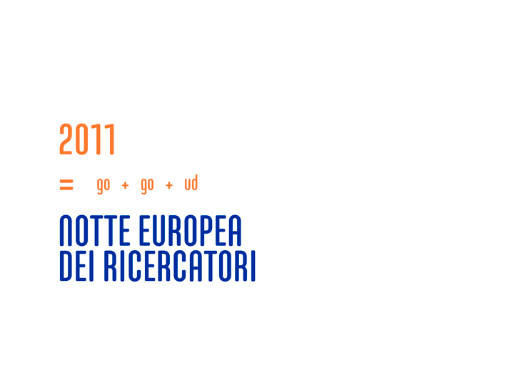
Notte Europea
dei Ricercatori
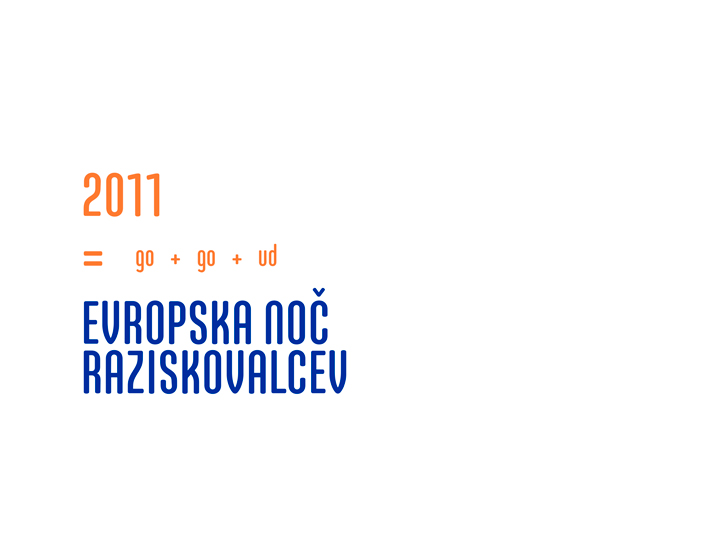
2011
Identity ✓
What follows is my identity proposal for the ‘European Researchers Night 2011′ for the cities of Gorizia (Italy), Nova Gorica (Slovenia) and Udine (Italy) — a festival dedicated to science, whose purpose is to present in a fun and ‘cool’ way science to the public, stimulating the desire for knowledge and discovery through scientific demonstrations on site and many different events.
The idea behind the creation of the identity for The European Researchers’ Night 2011 event is to communicate with a strong festive visual impact but at the same time with elegance and solemnity — relevant to the context of the research.
The main message of this identity is a sensation of research closer to the people; research that communicates in a fresh way but does not use frivolous and trivial channels; a research that ‘is presented to young people’ in a modern and funny method — aware, however, of its importance.
In simply terms: European Researchers’ Night 2011 = an elegant party dedicated to research with young target.
The concept
and the structure of the mark
explained in thirteen steps
If you are interested in knowing more about the working process of this project the following thirteen ‘chapters’ will explain you the methodology ― for how singular or eccentric it could be ― with which I approached in the creation phase. The animation here below quickly summarize the featured elements, the basic structure guidelines and all that technical — and I hope not, at the end, boring — stuff that is explained particularly step by step by scrolling down.
01
Communication
keywords
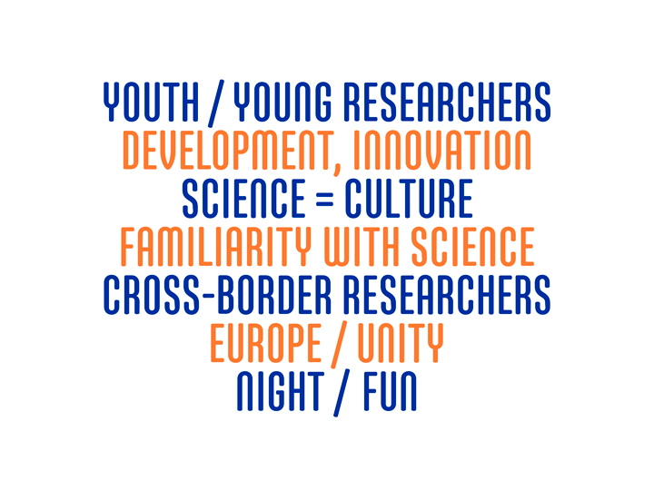
Listed here below there are some keywords, present in the event creation brief, fundamental to be transmitted through the visual identity. Many demands and many facets which I tried to summarize in what I am going to present in this article.
02
The origin
of the sign
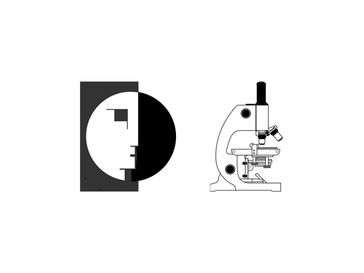
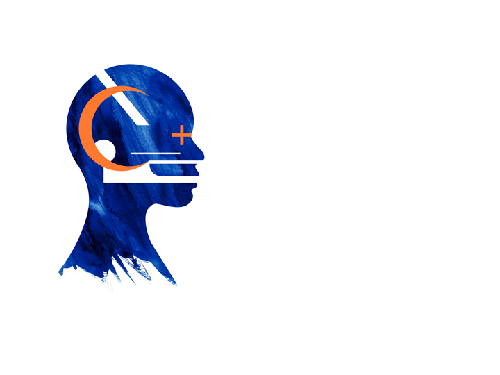
I decided to develop the concept of the identity for the European Researchers’ Night 2011 around elements typically connected to research and tried to put them in a graphic/artistic context. The references on which the work is developed are the microscope and visual style of the Bauhaus artistic movement. Further inspiration for the sign is the image seen in the advertisings of Maxxi museum in Rome.
03
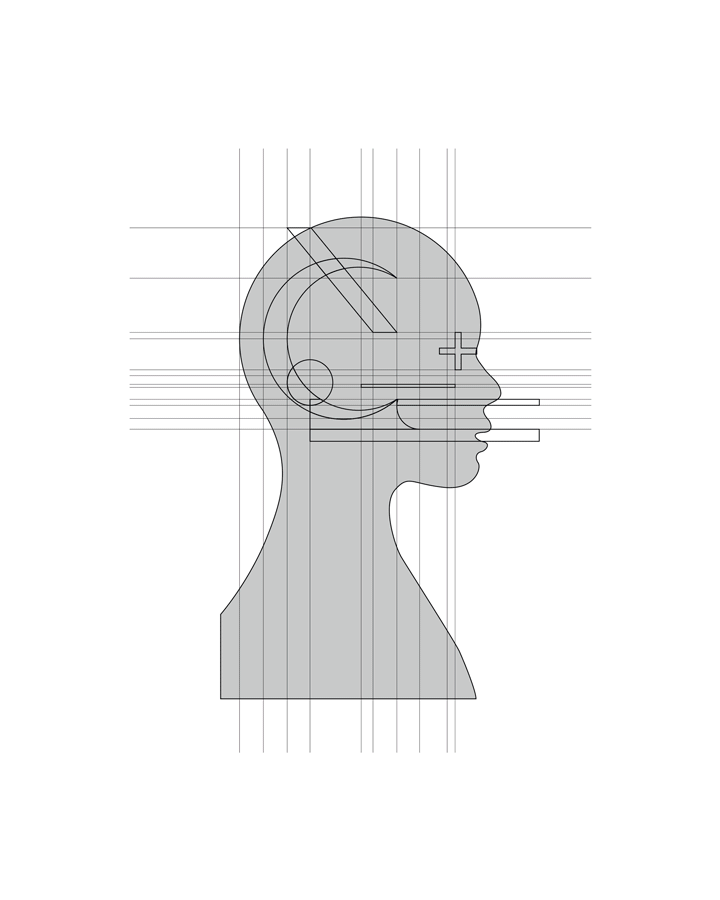
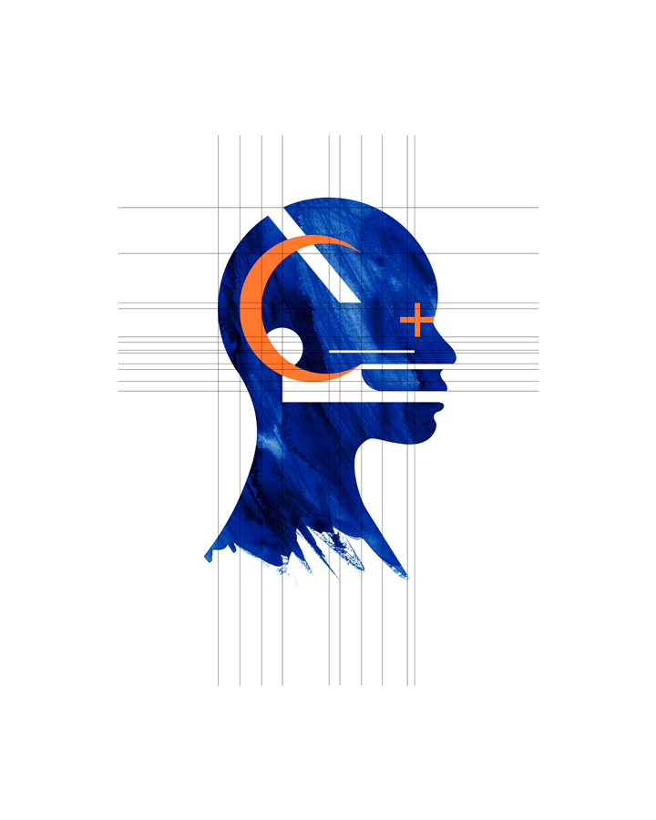
Structure of the symbol —
Silhouette
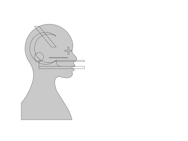
Design of the silhouette as container of graphic elements. The silhouette depicts ‘the researcher’.
04
Structure of the symbol —
Size
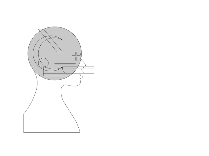
The space in which the geometric shapes are placed. The size developes itself, de facto, where the ‘head’ is.
05
Structure of the symbol —
Graphics, part one
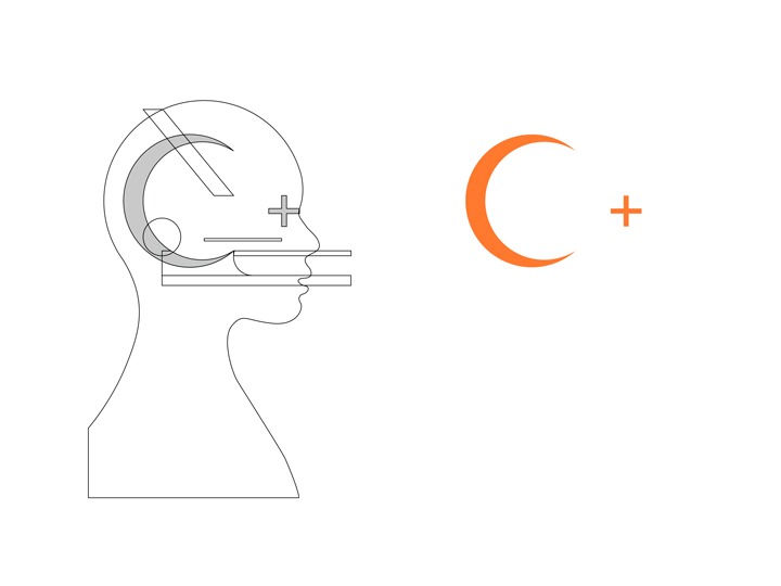
The moon and the ‘plus’ (+): these are the first two graphic elements that compose the identity. The moon, a shape that represents the night and the party. ‘Plus’ (+), a mathematic symbol but also a sign that represents contact.
06
Structure of the symbol —
Graphics, part two
The microscope — designed in the Bauhaus style — is positioned within the footprint. It incorporates in its structure the moon, already previously inserted.
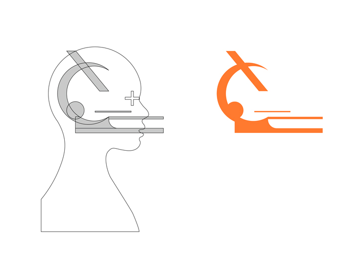
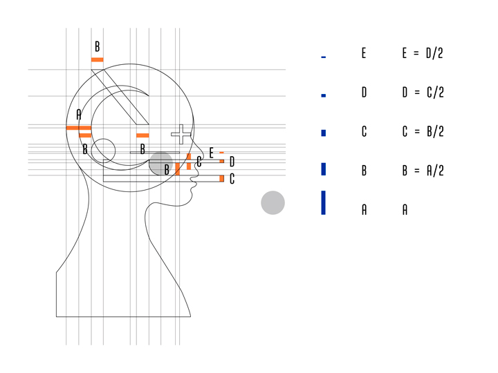
07
Structure of the symbol —
Grid
All the distances, the proportions and the alignments between the elements that make up the symbol.
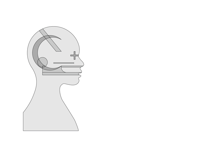
08
Structure of the symbol —
The final composition
All the elements that compose the symbol — altogether — distinguished in between them by different shades of gray.
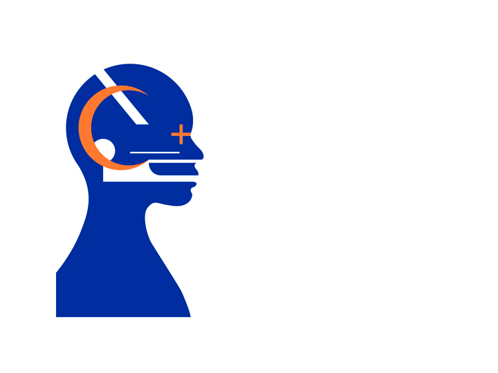
09
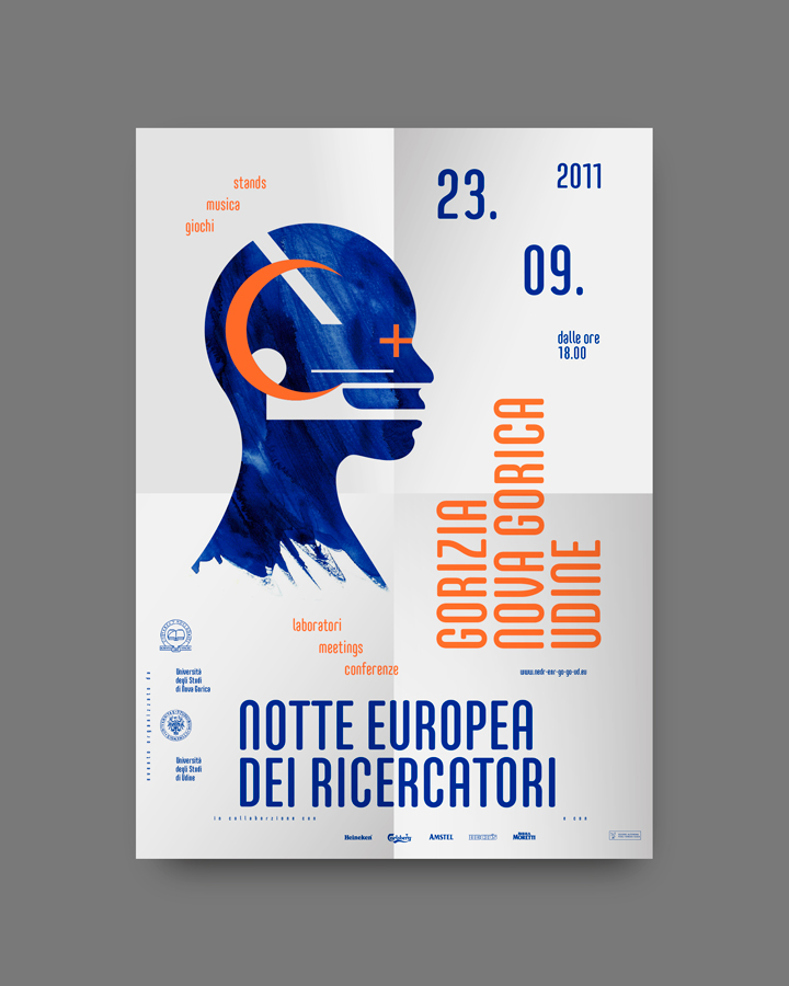
The colouring
of the mark
I used pretty impressive, flashy and almost fluorescent colors to make the identity catchy and cool. A highly visible orange color is used to highlight the moon and ‘plus’ graphic elements. The silhouette is coloured in a deep blue, color both of the night and of the European Union flag. The microscope is ‘cutted’ into the silhouette.
10
Adding
a texture
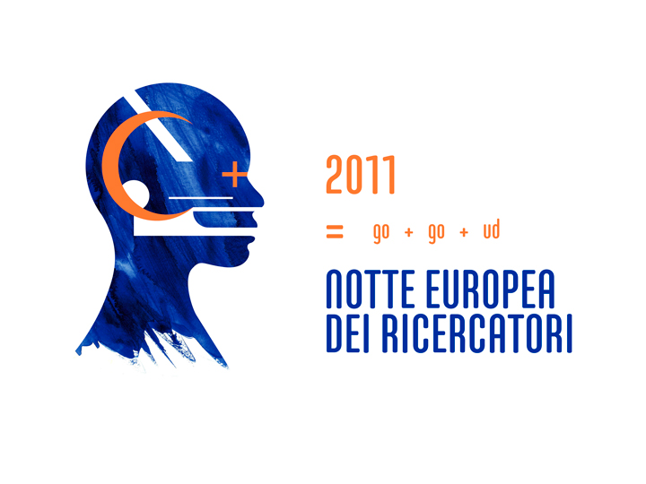
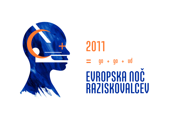
In the final phase of identity’s creation the blue color of the silhouette is replaced by a painted texture — always in blue/night blue tint — in the way to get a greater visual impact and to get the most eye-catching, youthful and contemporary.
11
The lettering
of the naming
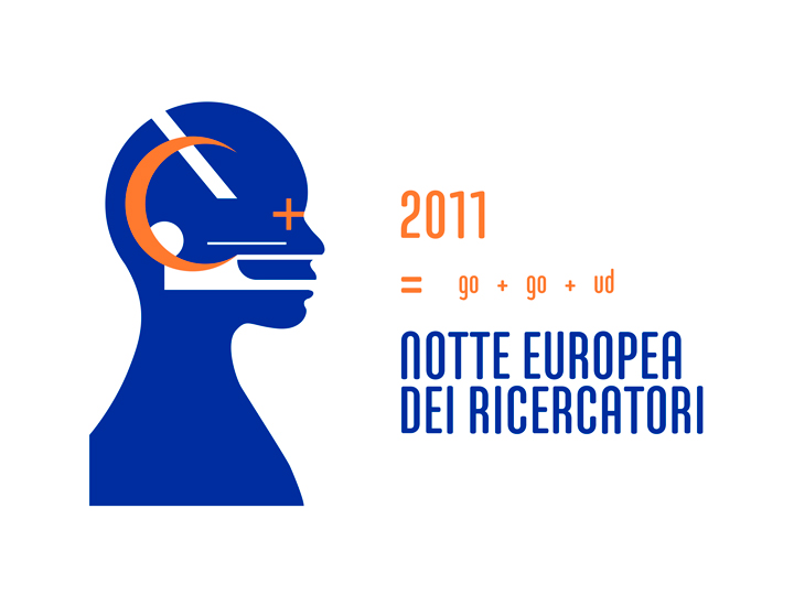
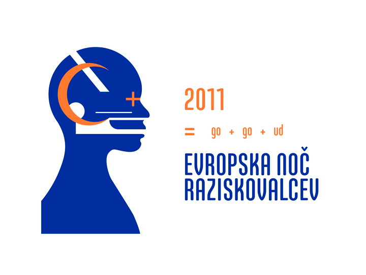
The 2011 edition of the ‘European Researchers Night’ took place in three cities, two in Italy (Gorizia and Udine) and one in Slovenia (Nova Gorica). I decided to use a lettering joke to empathise this cross-border ‘unifying’ event’s characteristic. GO + GO + UD is a cities’ names abbreviation sketch, accosted in the identity to both the italian and slovenian version of the event’s naming.
12
The assembled
identity
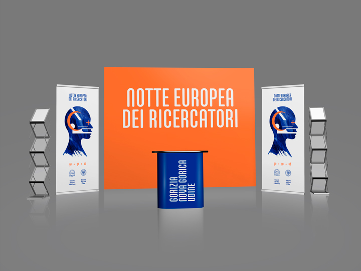
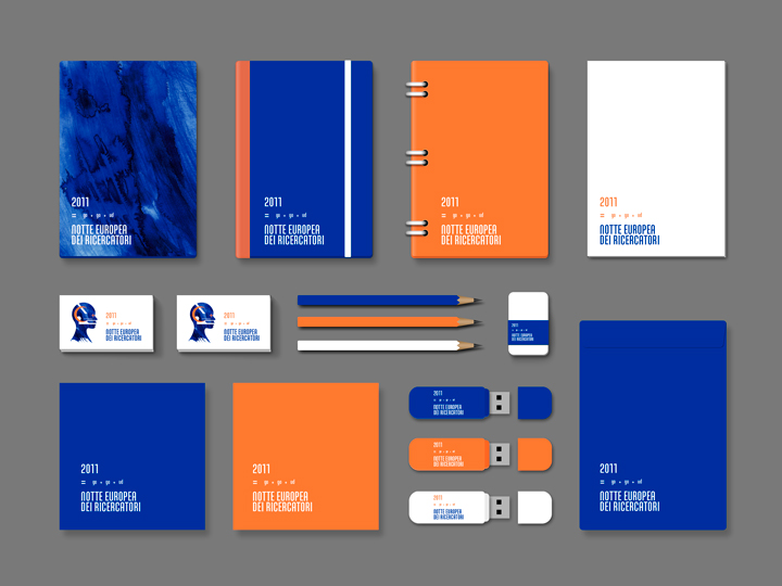
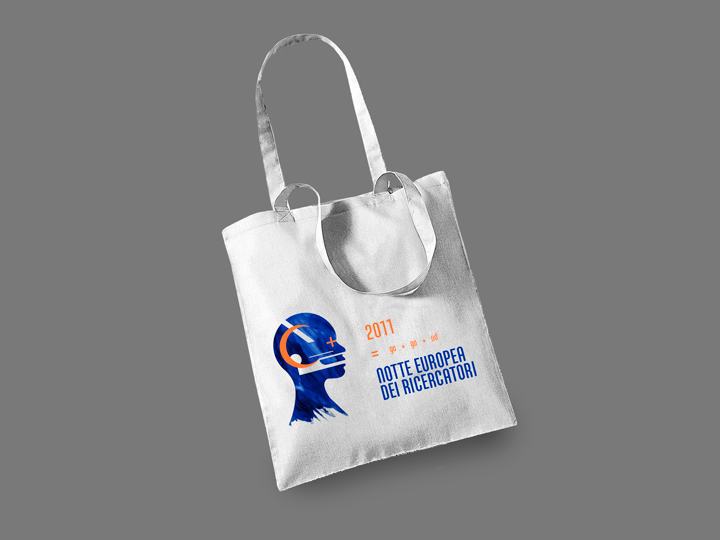
The symbol combined with the ‘bilingual’ lettering, composing the definitive brand.
13
The final
result
The italian and the slovenian declination of the finished identity proposal. Young and fresh, thoughtful and conceptual.
Notes
This is a proposal made for a contest. The marks and logos showed in the images above are used just as fillers in the designs layout. This work was made with no commercial intention and no profit was ever derived from it. All the materials used here were managed only for presentation purposes.
Credits
Creative direction → Aleš Brce
Art direction → Aleš Brce
Graphic design → Aleš Brce
Year → 2011