Settimi & Ziani
Identity ✓ Packaging ✓
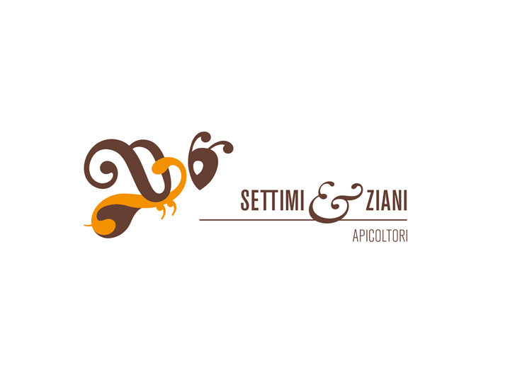
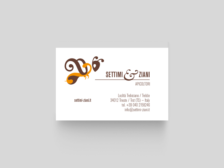
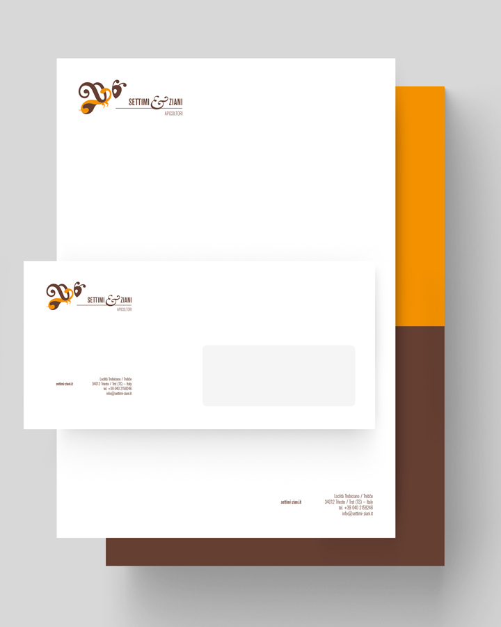
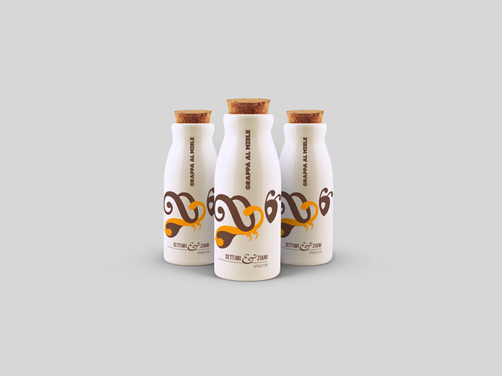
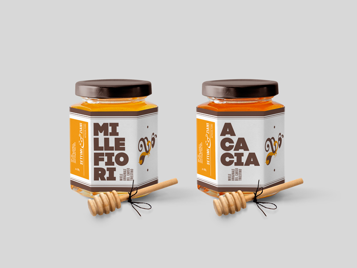
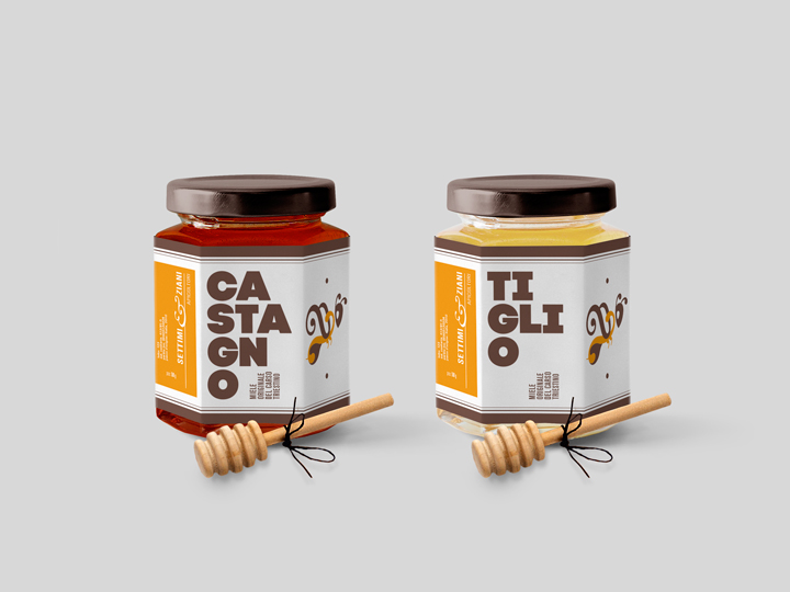
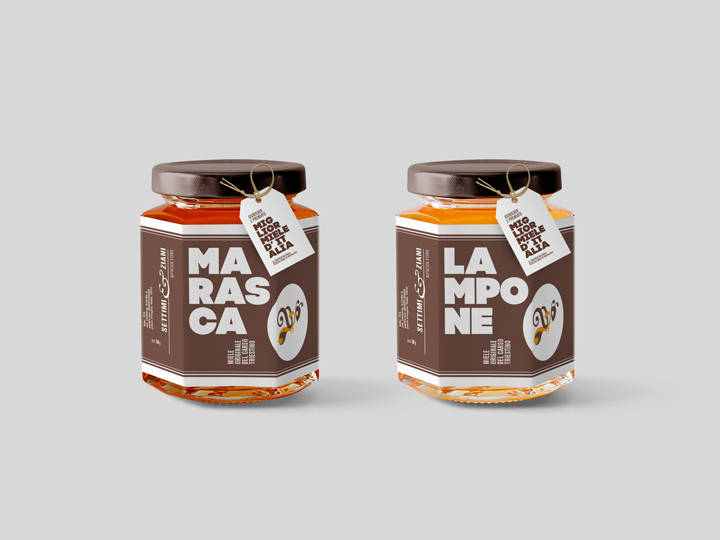
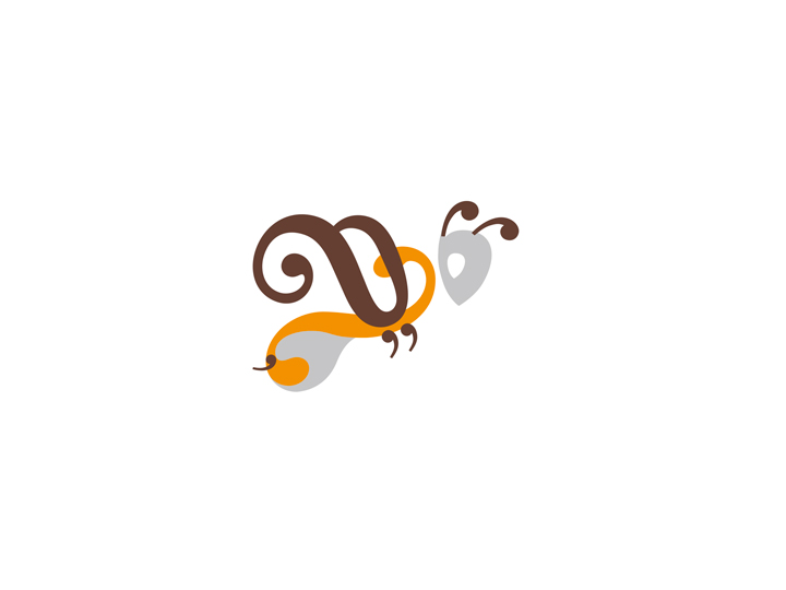
Settimi & Ziani is a beekeepers company from Trieste (Italy), producing quality and tasty varieties of honey. For their identity I created a captivating but not commonplace brand; a modern and appealing visual identification that is linked to the tradition, to the territory and completely devoted to the art of beekeeping — as the spirit of the Settimi & Ziani agricultural activity is. All around a ‘typo-bee-symbol’ (whose creative process you can discover by scrolling down the page) I made the company’s business cards, the stationery and the honey jar etiquettes and packagings.
The concept of the sign —
Beekeeping meets typography
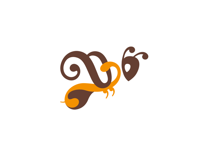
I decided to create, as an iconographic symbol, a traditional-for-the-sector bee-mark but designed and structured with lots of bee-professionism conceptual peculiarities melted with some typographic details, tracing so a connection between two apparently very different professions that are however pretty similar: the job of the beekeeper and the job of the typedesigner. Both require much passion to be conducted well, both are solemn to its operators.
The origin of the sign —
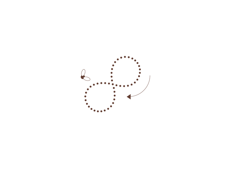
Waggle dance and ampersand
Bee comunication system directly linked to the company’s communication: the study of the brand stems here, and precisely from a research conducted on the bee communication characteristics. The honey bee communicates the location, extent and nature of nectar sources through a dance in the form of 8 — the so-called ‘waggle dance‘ — conducted with different rates depending on the distance and direction of the food source from the hive. The characteristic sign that has determined the visual element is, therefore, the bee oscillation in the communication.
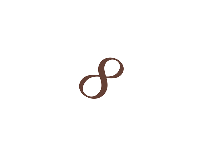
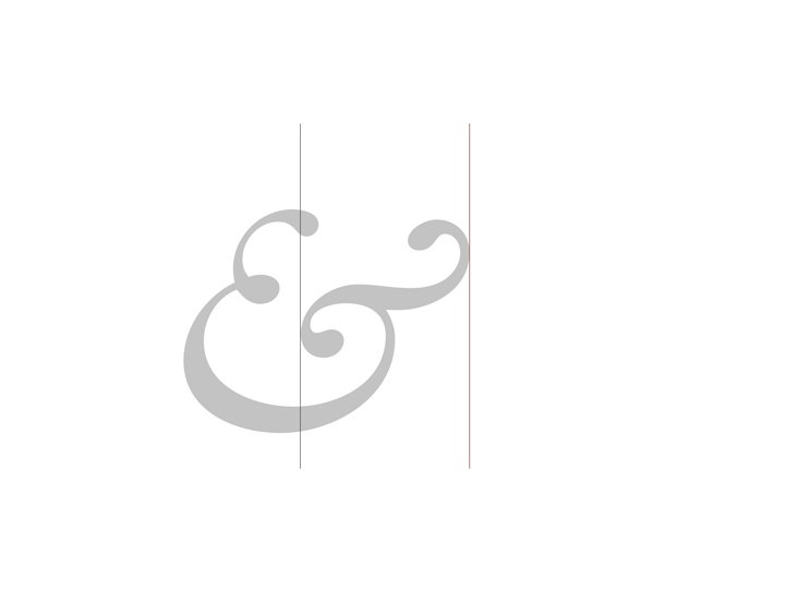
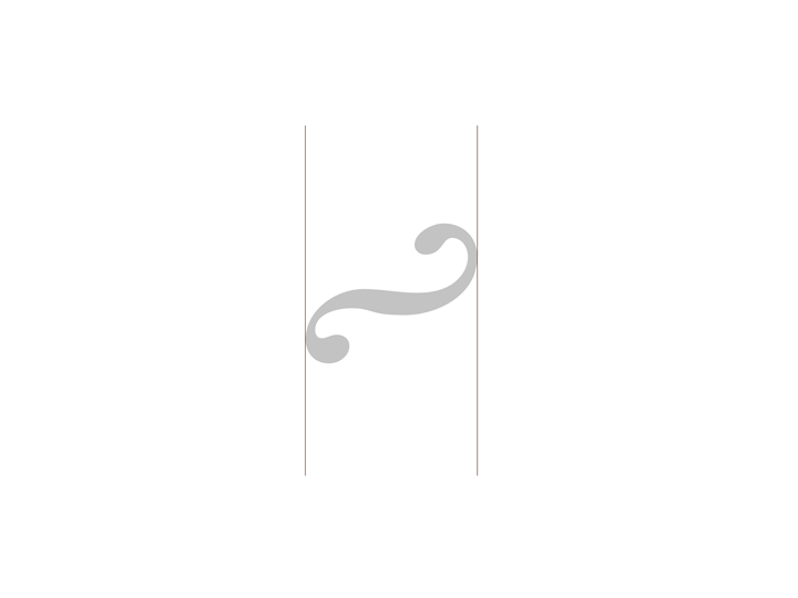
Another factor that influenced the creation of the brand is the importance of the hard work of beekeepers who, like the honey bees, collaborate and work hard to get the best product. Unity make strength, as they say. Being Settimi & Ziani a family-led business, these elements are even more important. The letter ‘&’ (ampersand) is a pretty rapresentative sign for these ‘unity characteristics’ and so I decided to use it in graphically depicting such collaboration. Being then also present in the name of the company I decided to literally exploit it visually.
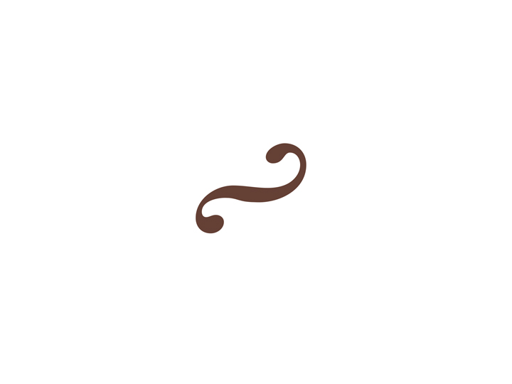
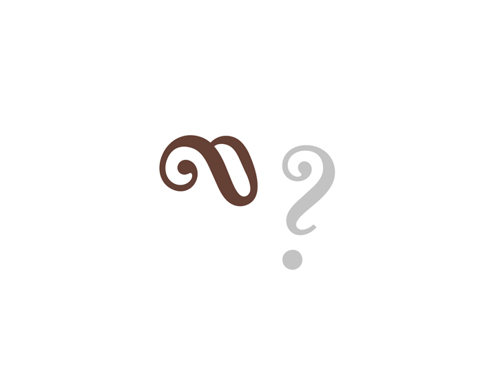
Breaking down, decomposing the letter ‘&’ of a classical serif typeface I got a curve that graphically relates to ‘waggle dance’, creating a conceptual link between beeking and typography.
The structure of the sign —
Adding glyphs
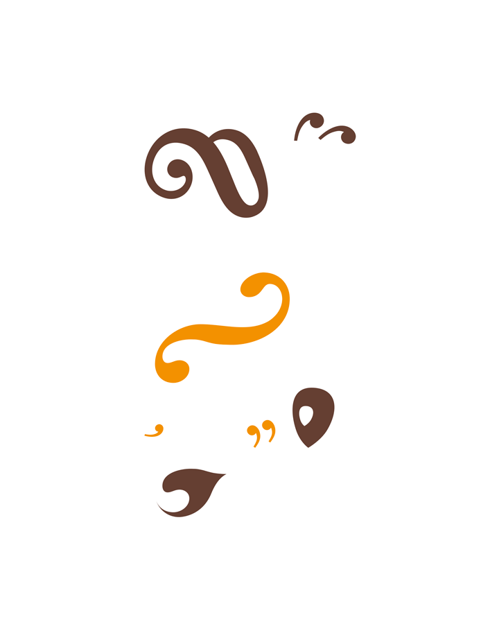
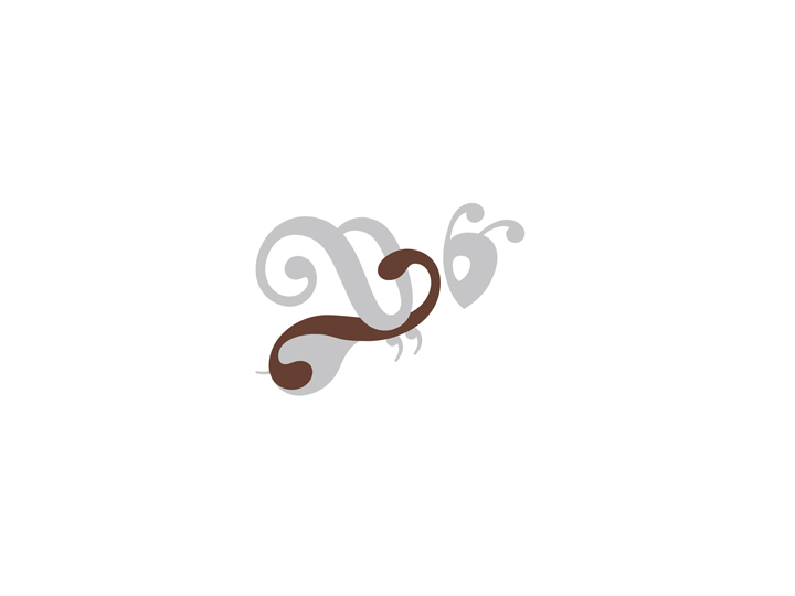
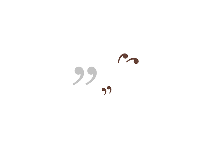
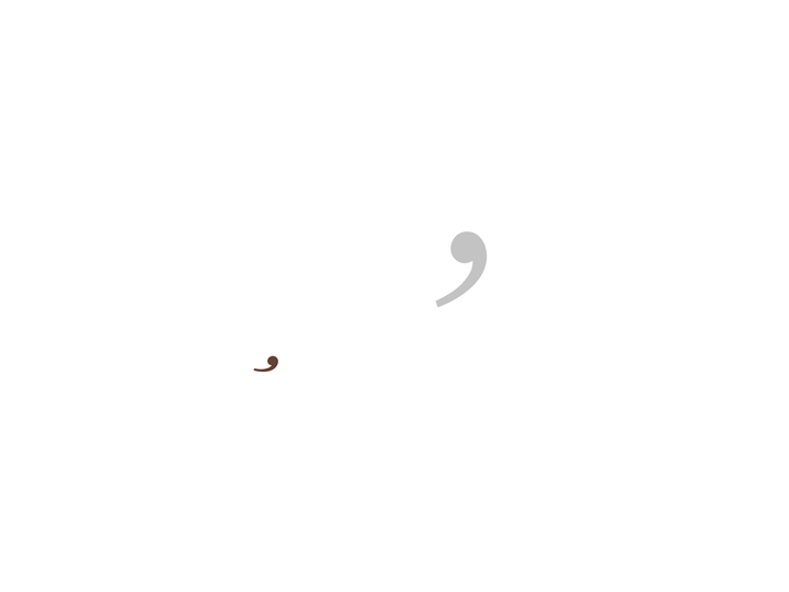
The core of the brand structure is — as explained before — the curve obtained from the letter ‘&’ and the letter ‘&’ itself. Starting from these two graphic elements I already got, I obtained, by deconstructing other letters/glyphs — always from the same typeface family of the classical serif font used earlier — a bunch of other forms that make up the finished symbol.
The logotype —
Naming and colors
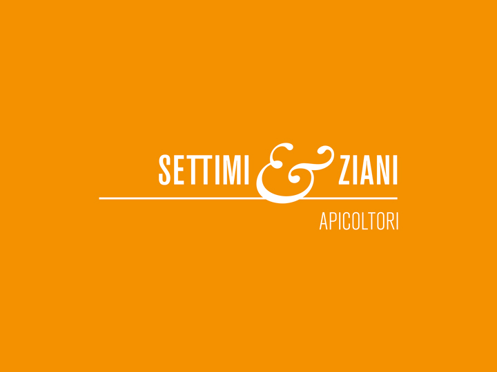
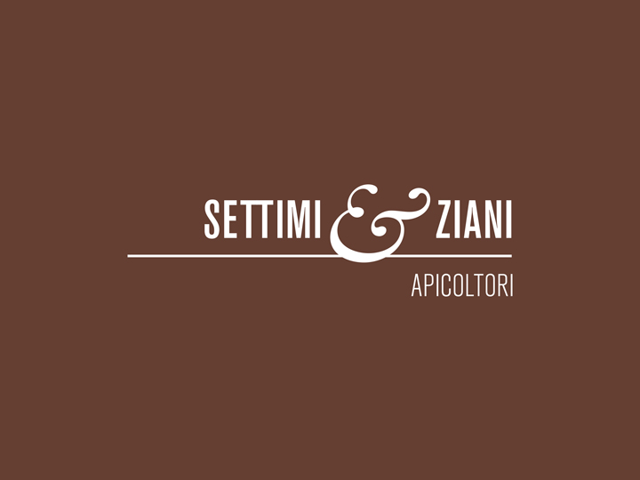
While creating the logotype (the name of the company treated with graphic elements without altering its readability, accompained by the bee-mark already presented) I used a sans serif condensed font, pretty actual and clean, in combination with the already-seen-before seriffed ‘&’. The colors used are — at the end — very typical in the ‘beekeepers universe': a slightly dark orange and a crispy brown.
Concluding I hope you found this identity sweet. As honey is. Thank you kindly for watching.
Credits
Creative direction → Aleš Brce
Art direction → Aleš Brce
Graphic design → Aleš Brce
Year → 2010