
The Academy
— Mo’ Complicated
Art direction ✓ Music ✓
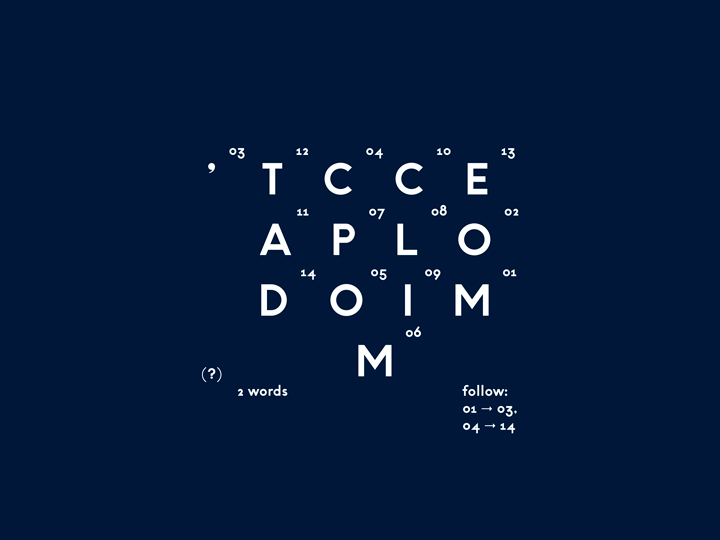
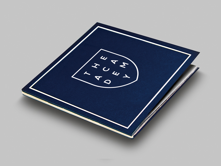
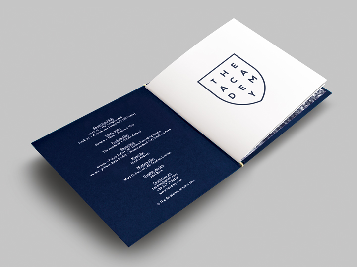
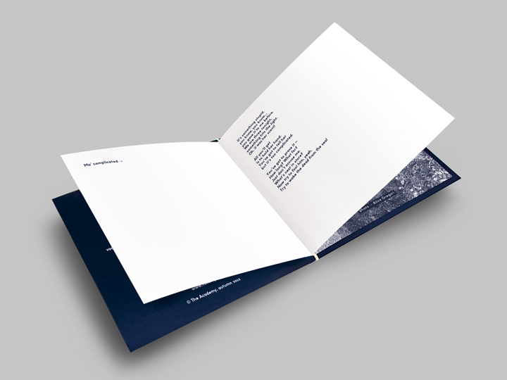
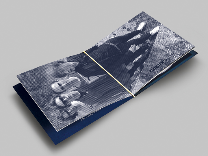
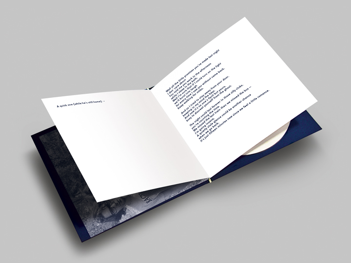
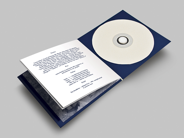
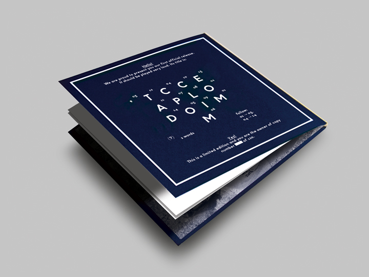
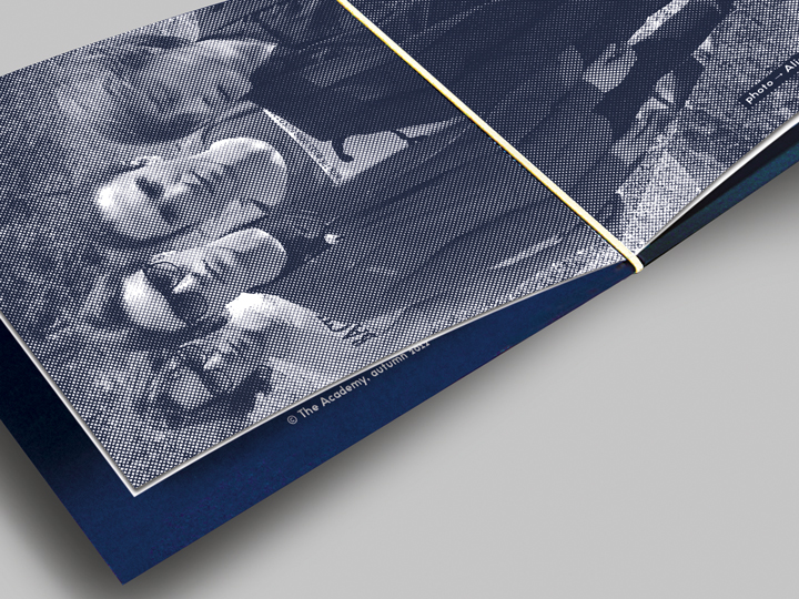
‘Exclusivity’ is the blurb for the artwork made for this EP. Being this issue a release with two songs it has to be a unique object, a precious thing to be possessed in an era of digital downloads and mp3. The band’s music (a simil new wave genre mixing punk atmospheres with pop elements) deserves to be presented to the fans in a special packaging. Exclusivity started already by thinking on the band’s name: The Academy. I created a logotype reminiscent of the coats of arms, but in a very ‘typographic’ way. The whole lettering of the layout is made with a single font, willing strongly but playfully at the same time (the back cover features a lettering joke playing with the EP’s name – Mo’ Complicated – mixing letters and numbers in a — reconnecting to the title — complicated way). It is silk screened on Fedrigoni Sirio 700 gsm dark blue cardboard 100×70 cm sheets — previously hand cutted — and contains a monocolor printed booklet with lyrics and photo bound with an elastic. Produced in only 120 numbered copies. Completely DIY and totally unique.

Credits
Creative direction → Aleš Brce
Art direction → Aleš Brce
Graphic design → Aleš Brce
Link → The Academy on Bandcamp
Year → 2012